FlexSim 2018 includes functionality for creating a custom table view GUI using a custom data source from within FlexSim. This article will go through the specifics of how to set this up.
The Callbacks Custom Table Data Source defines callbacks for how many rows and columns a table should display, what text to display in each of the cells, if they're read only etc. If you require further control of your table you can use a DLL or module and sub class the table view data source in C++.
An example of how this data source is used can be seen in the Date Time Source activity properties.
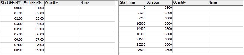
In the above table, the data being used to display both of these tables is exactly the same. The raw treenode table data can be seen on the right. The table on the left is displaying the hours and minutes for each start and end time rather than the the start time and duration in seconds.
In FlexSim 2018, there are a number of tables that currently utilize this new data source. They can be found at:
VIEW:/modules/ProcessFlow/windows/DateTimeArrivals/Table/Table
VIEW:/pages/statistics/ChartTemplateProperties/tabcontrol>variables/tabs/StatePieOptions/SplitterPane/States/Table
VIEW:/pages/statistics/ChartTemplateProperties/tabcontrol>variables/tabs/CompositeStatePieOptions/SplitterPane/States/Table
VIEW:/pages/statistics/ChartTemplateProperties/tabcontrol>variables/tabs/StateBarOptions/SplitterPane/States/Table
Copying one of these tables can be a good starting point for defining your own table. The first thing you have to do in order for FlexSim to recognize that your table is using a custom data source is to add a subnode to the style attribute of your table GUI. The node's name must be FS_CUSTOM_TABLE_VIEW_DATA_SOURCE with a string value of Callbacks.

Set your viewfocus attribute to be the path to your data. This may just be a variable within your table. It's up to you to define what data will be displayed.

If you want to have the default functionality of the Global Table View, you can use the guifocusclass attribute to reference the TableView class. This gives you features like right click menus, support for cells with pointer data (displays sampler), tracked variables (displays edit button) and FlexScript nodes (displays code edit button).

If you're going to use this guiclass, be sure to reference the How To node (located directly above the TableView class in the tree) for which eventfunctions and variables you can or should define.
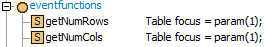
At this point you're ready to add event functions to your table. There are only two required event functions. The others are optional and allow you to override the default functionality of the table view. If you choose not to implement the optional callback functions, the table view will perform its default behavior (whether that's displaying the cell's text value, setting a cell's value, etc). These event function nodes must be toggled as FlexScript.
The following event functions are required:
---getNumRows---
This function must return the number of rows to display in the table. 0 is a valid return value.
param(1) - View focus node
---getNumCols---
This function must return the number of columns to display in the table. 0 is a valid return value.
param(1) - View focus node
The following event functions are optional:
---shouldDrawRowHeaders---
If this returns 1, then the row headers will be drawn. The header row uses column 0 in the callback functions.
param(1) - View focus node
---shouldDrawColHeaders---
If this returns 1, then the column headers will be drawn. The header column uses row 0 in the callback functions.
param(1) - View focus node
---shouldGetCellNode---
Allows you to decide whether you want to override the table view's default functionality of getting the cell node.
param(1) - The row number of the displayed table
param(2) - The column number of the displayed table
If shouldGetCellNode returns 1 then the following function will be called:
---getCellNode---
Return the node associated with the row and column of the table.
param(1) - The row number of the displayed table
param(2) - The column number of the displayed table
---shouldSetCellValue---
Allows you to decide whether you want to override the table view's default functionality of setting a cell's value.
param(1) - The cell node as defined by getCellNode
param(2) - The row number of the displayed table
param(3) - The column number of the displayed table
If shouldSetCellValue returns 1 then the following function will be called:
---setCellValue---
Here you can set your data based upon the value entered by the user.
param(1) - The row number of the displayed table
param(2) - The column number of the displayed table
param(3) - The value to set the cell
---isCustomFormat---
Allows you to decide whether you should define a custom text format for the cell.
param(1) - The cell node as defined by getCellNode
param(2) - The row number of the displayed table
param(3) - The column number of the displayed table
If isCustomFormat returns 1 then the following functions will be called:
---getTextColor---
Return an array of RGB components that will define the color of the text. Each component should be a number between 0 and 255. [R, G, B] for example red is [255, 0, 0].
param(1) - The cell node as defined by getCellNode
param(2) - The row number of the displayed table
param(3) - The column number of the displayed table
param(4) - The text to be displayed in the cell
param(5) - The desired number precision
---getTextFormat---
Return 0 for left align, 1 for center align and 2 for right align.
param(1) - The cell node as defined by getCellNode
param(2) - The row number of the displayed table
param(3) - The column number of the displayed table
param(4) - The text to be displayed in the cell
param(5) - The desired number precision
---shouldGetCellColor--- Allows you to decide whether you should define a color for the cell's background.
param(1) - The cell node as defined by getCellNode
param(2) - The row number of the displayed table
param(3) - The column number of the displayed table
If shouldGetCellColor returns 1 then the following function will be called:
---getCellColor---
Return an array of RGB components that will define the cell's background color. Each component should be a number between 0 and 255. [R, G, B] for example red is [255, 0, 0].
param(1) - The cell node as defined by getCellNode
param(2) - The row number of the displayed table
param(3) - The column number of the displayed table
---shouldGetCellText--- Allows you to decide whether you want to override the table view's default functionality of getting a cell's text.
param(1) - The cell node as defined by getCellNode
param(2) - The row number of the displayed table
param(3) - The column number of the displayed table
If shouldGetCellText returns 1 then the following function will be called:
---getCellText---
Return a string that is the text to display in the cell.
param(1) - The cell node as defined by getCellNode
param(2) - The row number of the displayed table
param(3) - The column number of the displayed table
param(4) - The desired number precision
param(5) - 1 if the cell is being edited, 0 otherwise
---shouldGetTooltip---
Allows you to decide whether a tooltip should be displayed when the user selects a cell in the table.
param(1) - The cell node as defined by getCellNode
param(2) - The row number of the selected cell
param(3) - The column number of the selected cell
If shouldGetTooltip returns 1 then the following function will be called:
---getTooltip---
Return a string that is the text to display in the tooltip.
param(1) - The cell node as defined by getCellNode
param(2) - The row number of the selected cell
param(3) - The column number of the selected cell
---isReadOnly---
Return a 1 to make the cell read only. Return a 0 to allow the user to edit the cell.
param(1) - The row number of the displayed table
param(2) - The column number of the displayed table