Hi
I wanted to create an adjacency diagram based on the model input that shows the most used pathways based on the locations. How can I create that? Also, how can I filter it based on person type? Thanks!
Hi
I wanted to create an adjacency diagram based on the model input that shows the most used pathways based on the locations. How can I create that? Also, how can I filter it based on person type? Thanks!
Would you mind elaborating on your comment more? Thanks!
Hi @Zahra Z, was Jeanette F's answer helpful? If so, please click the "Accept" button at the bottom of their answer. Or if you still have questions, add a comment and we'll continue the conversation.
If we haven't heard back from you within 3 business days we'll auto-accept an answer, but you can always unaccept and comment back to reopen your question.
Hello @Zahra Z,
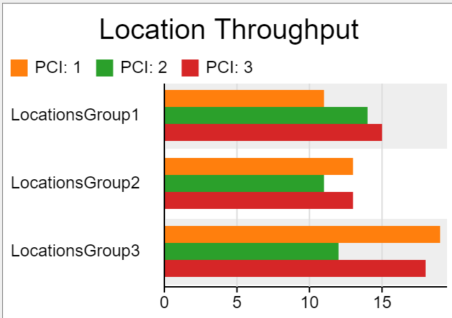
Would a location throughput chart work? It would show the total number of patients in the model. You can create a subset that sorts by location groups you select and it can be partitioned by patient labels as well.
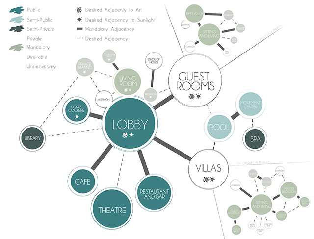
@Jeanette F , that is also helpful. But, I am trying to help designers and planners understand the priority of spatial closeness. Seean example below: ADJACENCY.png
Hello @Zahra Z, Your adjacency chart takes into account how locations are inter-connected. This is represented in how the process flow can visually be seen but it is not a chart that changes with data. You can place different colored containers around different blocks of activities to follow a key or legend you define like in the adjacency diagram and you can edit the connectors between blocks to see also follow a key or diagram.
Flexsim's charts and graphs possibilities run off of generated statistics.
In all, the adjacency chart cannot be autogenerated from FlexSim, but you can create charts paired with the process flow to convey similar information. You could also use the data and knowledge of the process flow to create an adjacency plot of your own in a different application.
10 People are following this question.
© 1993- FlexSim Software Products, Inc. All Rights Reserved.
FlexSim is a fully 3D simulation software environment. FlexSim can be used to simulate any process in any industry.
FlexSim®, FlexSim Healthcare™, Problem Solved.®, the FlexSim logo, the FlexSim X-mark, and the FlexSim Healthcare logo with stylized Caduceus mark are trademarks of FlexSim Software Products, Inc. All rights reserved.
