question

Akhil raja rao K avatar image
0 Likes"
Akhil raja rao K asked tannerp commented

How to create pic chart for flow items in process flow?

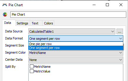
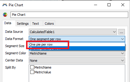
I'm working on a shopping mall simulation model for 7000 people in the process flow. People will be generated from a schedule source (an excel sheet of people entry time and the number will be uploaded in schedule source). I'd like to deduce the statistics of people's behavior in the shopping mall on a pie chart. i.e percentage of people's waiting time at 3 different areas should include in a single pie chart (as shown in the attached image). I've attached a sample model which represents my actual model (please find the attachment) question-on-pie-charts.fsm

FlexSim 20.0.0
process flowdashboardsstatisticspie charts
5 |100000

Up to 12 attachments (including images) can be used with a maximum of 23.8 MiB each and 47.7 MiB total.

1 Answer

·
tannerp avatar image
0 Likes"
tannerp answered tannerp commented

Hi @Akhil raja rao K,

You can do this using labels, a Statistics Collector, and a Calculated Table. Let me explain each in some detail, then if you have questions, you can ask for more specifics.

LABELS:

The person flow items in your model need labels assigned when they arrive at and leave each area. This is done with OnEntry and OnExit triggers on the waiting lines. The A1Entry and A1Exit labels for the area 1 waiting line are assigned in the OnEntry and OnExit triggers, respectively. The labels are a time value. Also included on the OnExit trigger is a calculation of the total time spent at the waiting line, which is just the difference between the two labels.

STATISTICS COLLECTOR:

The Statistics Collector listens to the person flow items being destroyed (or you could listen elsewhere, but the sink was easier) at the "Remove Person" activity in Process Flow. Every time a token passes through this activity, the Statistics Collector takes the person's calculated labels of time spent in each area and stores them in a table. The data shape looks like the image below.

CALCULATED TABLE:

The Calculated Table runs a simple query that sums each of the columns: A1Time, A2Time, and A3Time. This makes it possible to read the data in a pie chart. The query setup is shown in the next image. The pie chart setup should be fairly straightforward.

Here's the updated model: pie-charts-for-areas.fsm Note that your model is throwing lots of errors on the animations... might be worth looking into that as well.

Hope this helps!


· 2
5 |100000

Up to 12 attachments (including images) can be used with a maximum of 23.8 MiB each and 47.7 MiB total.

Akhil raja rao K avatar image Akhil raja rao K commented ·
@tanner.p
I've tried your answer in a model, apart from a few errors, it's giving the desired result, many thanks for the well-explaining answer. Can we generate a pie chart for each and every passenger's entry time, exit time and waiting time at each area. (I mean 7000 pie charts for 7000 customers)
0 Likes 0 ·
tannerp avatar image tannerp Akhil raja rao K commented ·

You can do this by organizing the data a little differently (i.e. creating a new row for each person in the model), then change the setting shown below ("One pie per row", with the row being each respective person's entry) on the pie chart properties. This should do the trick.

1 Like 1 ·

Write an Answer

Hint: Notify or tag a user in this post by typing @username.

Up to 12 attachments (including images) can be used with a maximum of 23.8 MiB each and 47.7 MiB total.