question

Patrick N avatar image
0 Likes"
Patrick N asked Jordan Johnson commented

Milestone Sankey Challenges

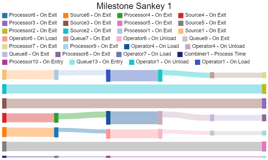
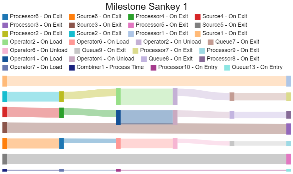
Milestone_Example.fsmI'm having challenges making Milestone Sankey illustrate the processes properly.

I have attached an example of my model. Queue7-9 has the option of pulling from the desired port. I wish for the Sankey to illustrate the flow depending on which port/option there has been chosen.

I have also added in the milestones the way I currently have done it. Hopefully, it will provide a picture of my desired outcome.


Hope it makes sense and that someone can help


Thanks in advance

FlexSim 22.1.0
milestone collectorsankey diagrammilestone sankey
milestone-example.fsm (328.4 KiB)
5 |100000

Up to 12 attachments (including images) can be used with a maximum of 23.8 MiB each and 47.7 MiB total.

1 Answer

·
Jordan Johnson avatar image
0 Likes"
Jordan Johnson answered Jordan Johnson commented

I think the Sankey chart is working correctly; it's just a little tricky to see what's going on. If I set all three parameters to Option1, and then run for a while, I get this chart:

1648245586218.png

With so many colors present, it can be hard to match the color to the object. But in FlexSim, you can hover over each rectangle to see its name.

By doing that, you can see that the top line flows from "Source1 - On Exit" to "Processor1 - On Exit" to "Operator1 - On Load" to "Queue7 - On Exit", and finally to "Processor7 - On Exit".

You can see that the second line only flows from "Source2 - On Exit" to "Processor2 - On Exit". But items don't flow past that point, because the downstream queue is only pulling from port 1.

So if I change the "Process 1-3" parameter to Option2, I get the following chart:

1648245852479.png

Now you can see that the top line only flows from "Source1 - On Exit" to "Processor1 - On Exit". Since the downstream queue is only pulling from port 2, the items stop there, and don't flow anywhere else. On the other hand, you can see that the items from Source 2 flow through many more steps.

Hopefully that makes some sense.


1648245586218.png (112.1 KiB)
1648245852479.png (113.8 KiB)
· 3
5 |100000

Up to 12 attachments (including images) can be used with a maximum of 23.8 MiB each and 47.7 MiB total.

Jordan Johnson avatar image Jordan Johnson ♦♦ commented ·
I forgot to mention, there's a duplicate milestone for "Operator2 - On Load". I did delete that, which helped the charts make a bit more sense.
0 Likes 0 ·
Patrick N avatar image Patrick N commented ·

Hi Jordan. Thank you very much for your answer. It clarifies it a bit more for me.
Do you know if it is possible to set the Sankey such that Processer1 will only be shown if Option1 is chosen, Processer2 if Option2, etc?

0 Likes 0 ·
Jordan Johnson avatar image Jordan Johnson ♦♦ Patrick N commented ·

In your situation, you'd probably need to change your model so that items don't flow the milestones you have selected. If any items flow through those milestones, the milestones will appear on the chart. But there are no chart-level options to hide or show that kind of data.

0 Likes 0 ·

Write an Answer

Hint: Notify or tag a user in this post by typing @username.

Up to 12 attachments (including images) can be used with a maximum of 23.8 MiB each and 47.7 MiB total.