question

Patryk avatar image
0 Likes"
Patryk asked Jason Lightfoot commented

Custom GUI chart

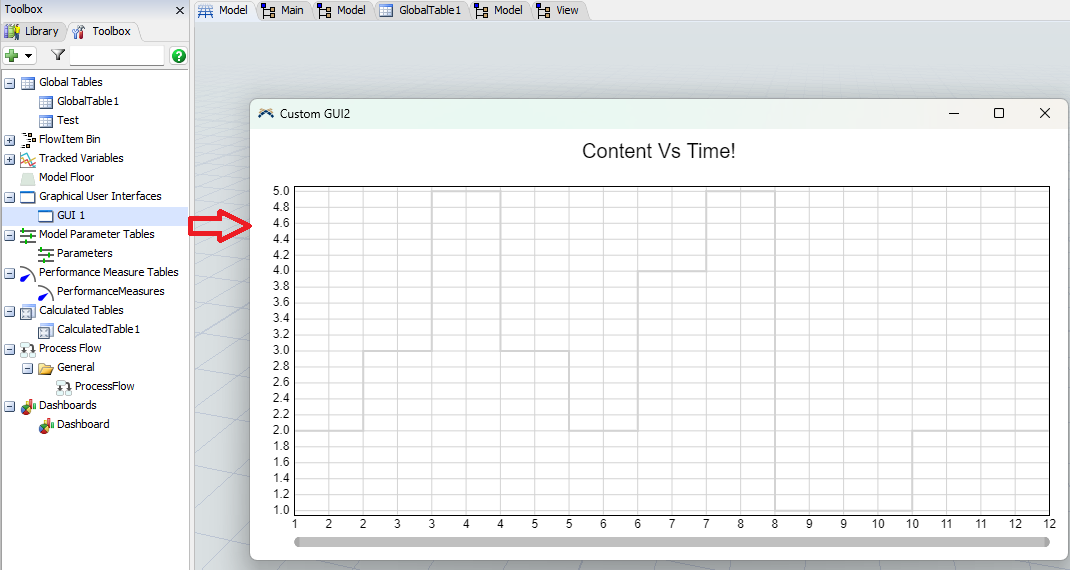
I would like to create a "Content VS Time" chart that is displayed in a custom GUI.

I managed to create a chart, but I don't know how to change the color and edit the legend to show the queue name "Q".

I create data for the chart using a calculated table.

Model: wykresy_4.fsm

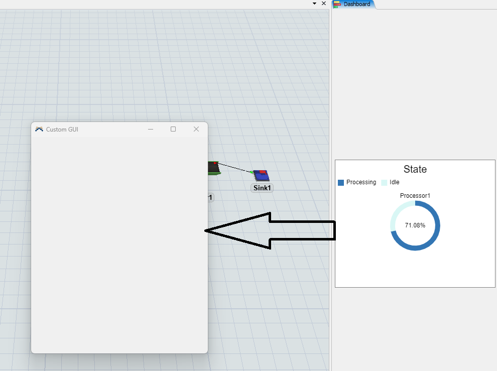
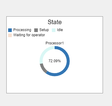
And how to create a pie or line chart showing machine states in the custom GUI?

Obraz zawierający tekst, zrzut ekranu, Czcionka, designOpis wygenerowany automatycznie

he data for the graph for the queue was read from the global "Test" table.

I would like to display the same charts as are currently available in the dashboard, but in the Custom GUI

Currently the chart in the custom gui is gray and I would also like to change it to a different color

FlexSim 23.2.2
codechartscustom gui
1703155930563.png (10.1 KiB)
wykresy-4.fsm (47.5 KiB)
5 |100000

Up to 12 attachments (including images) can be used with a maximum of 23.8 MiB each and 47.7 MiB total.

Joerg Vogel avatar image
1 Like"
Joerg Vogel answered Joerg Vogel commented

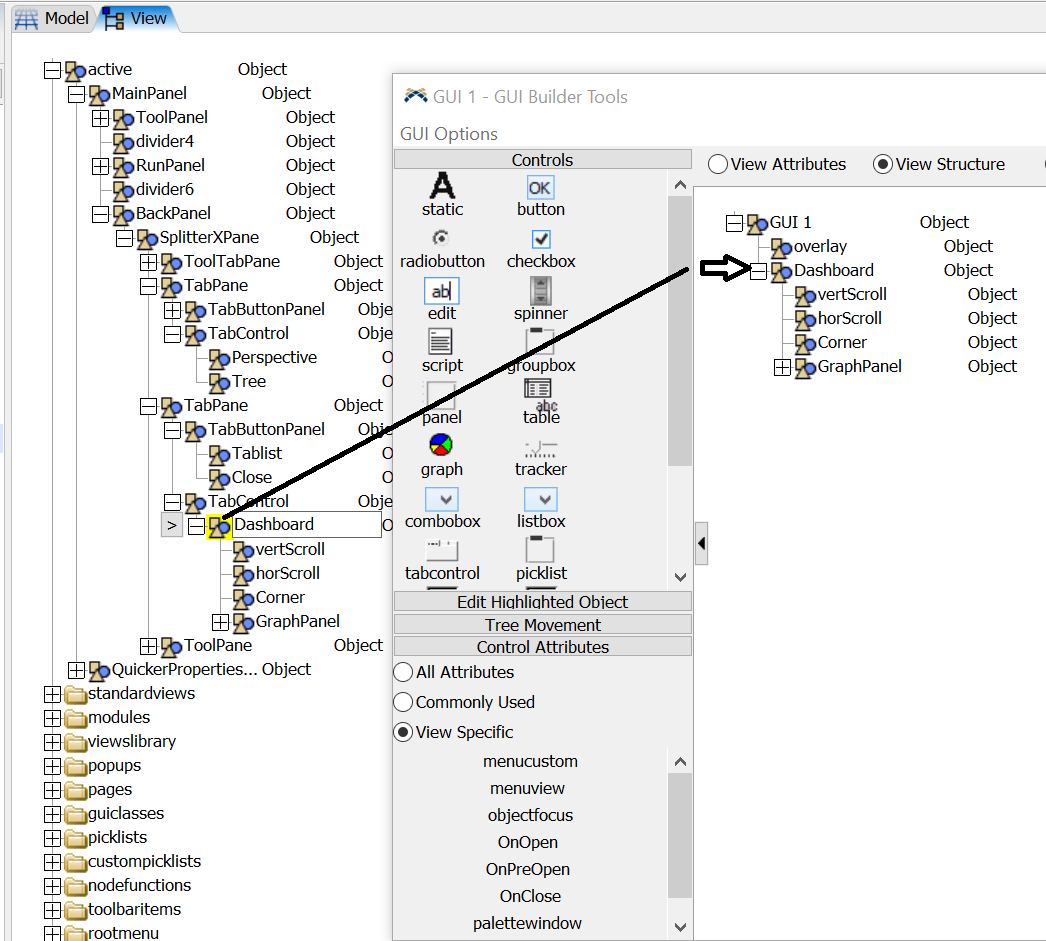
I cut a the Dashboard Node from View tree.

I added a new node below GUI1 by hitting return.

I pasted the cut dashboard node into this new node.

The chart moves from View into GUI view. It is then completly inactive from Workspace control then, once you activated the GUI view window. If you load such a model, the Dashboard view is only activateable until you open the GUI.Move_dashboard_to_GUI.fsm (FlexSim Version 24)

Edit:

Move_dashboard_to_GUI_jv.fsm(FlexSim Version 23.2)

dashboard-to-gui.jpg


· 1
5 |100000

Up to 12 attachments (including images) can be used with a maximum of 23.8 MiB each and 47.7 MiB total.

Joerg Vogel avatar image Joerg Vogel commented ·
Once you copy this node from View to GUI, you can edit any chart only in this GUI. But you can still drag other chart templates into this GUI.
0 Likes 0 ·
Mauricio Aranda avatar image
0 Likes"
Mauricio Aranda answered Jason Lightfoot commented

Currently i see that the chart is linked to a processor, if you want to change the legend from "Processor 1" to "Q", you can simply change the name of the processor to "Q" and it should change the chart legend. You can also change the name of the chart to anything you want by clicking the chart and changing its current name whis is "State".

To change the colors and the state names you would have to create a new pallete of colors and change it from the "Internal Pallet" to the one you make.


Hope this helps!

· 6
5 |100000

Up to 12 attachments (including images) can be used with a maximum of 23.8 MiB each and 47.7 MiB total.

Joerg Vogel avatar image Joerg Vogel commented ·
@Patryk, in Advanced Section you can install many chart types. This means they become visible in your toolbox. Once you did this you can directly edit many fields to custom values you like.

This was a default behavior in the past, but you need to know a lot more to do it right. FlexSim decided, that a fast and easy success doing something is better than to learn more scripted code right from a beginning. If you want to customize a template, then you can decide to learn much more or keep it simple. It is always up to you how deep you want to dive into script coding to customize your model. But then you have to learn needed basics on your own. There are tutorials or manual chapters building customized charts and statistic collectors. You find answers in form of articles in this forum to deal with special variants of static collection. Therefore you need to search them, you must build them, you need to test them and perhaps you have to ask new question how to adjust them to an actual new version of FlexSim. You see it is much more work than just to keep it simple.

0 Likes 0 ·
Patryk avatar image Patryk Joerg Vogel commented ·

This question is more about how to create charts from data in a custom GUI (even a simple chart of statistics or data from a table), and not about creating charts in dahsbord or using Calcualted table or other tools. Well, that's not a problem at all


0 Likes 0 ·
Patryk avatar image Patryk commented ·

I know how to change the chart in Dashboard, I mean to create the same chart as in the dashboard in Custom GUI1704649792658.png

0 Likes 0 ·
1704649792658.png (50.5 KiB)
Joerg Vogel avatar image Joerg Vogel Patryk commented ·
A custom GUI is not a Dashboard. A custom GUI is a construct much older in history of FlexSim. A Dashboard is a kind of a HTML browser. A GUI is a kind of Window construct from Windows system supported by templates in View tree. Maybe you can copy the Dashboard base frame to a GUI. Then you would be able to insert therein chart templates.
0 Likes 0 ·
Patryk avatar image Patryk Joerg Vogel commented ·

I know that custom GUi is not a dashboard, but it is possible to create a chart in it. The example is in the model sent above "GUI 1" 1704709031415.png

Unfortunately, I don't know how to create other charts in a different way, hence my question. Also in this chart I don't know how to change the color and some information. Unfortunately, copying the node of dashord to the GUI is not a solution because it is divided into several places, which makes this operation impossible.


0 Likes 0 ·
1704709031415.png (80.4 KiB)
Show more comments

Write an Answer

Hint: Notify or tag a user in this post by typing @username.

Up to 12 attachments (including images) can be used with a maximum of 23.8 MiB each and 47.7 MiB total.