I am attempting to use the Throughput per Hour graph with a Date Time Source in Process Flow… the instantaneous Throughput plot works fine, and it shows the throughput counting up fine for Source and Sink, but the Throughput per Hour graph doesn’t. It also shows different values for Source and Sink, even though they match on the instantaneous Throughput plot. I've attached a sample model for reference. The graph behavior also isn't consistent with using an inter-arrival source that is set to the same arrival rate... please let me know if I am missing something. Thanks in advance for your assistance.
processflow-throughput-per-hour.fsmUsing Throughput per Hour plots with Process Flow Date Time sources
FlexSim 20.0.0
This is definitely a bug. It will happen to any throughput per hour vs time template, where an activity is in the list of objects. To get around this bug (for now), you can install the template and make some changes to fix the issue.
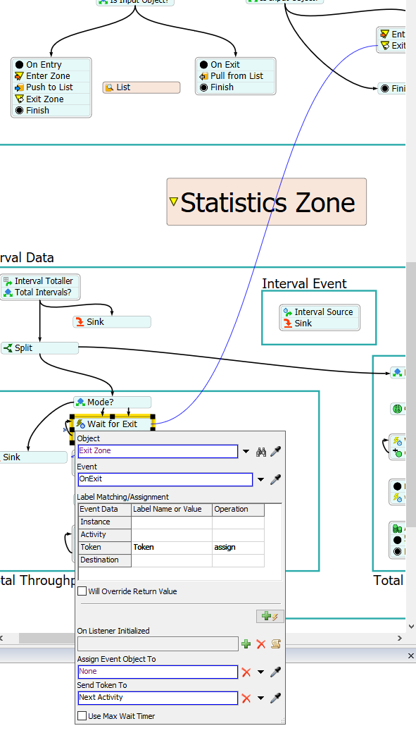
Once you've installed the template, you will see a new Process Flow in your toolbox. In that process flow, there is a container called Total Throughput. In that container is an activity called Wait for Exit. You should change this activity so it listens to the OnExit of the Exit Zone activity, rather than the OnExit of the Zone itself. Note that when you do this, you should be sure to assign the token parameter to a label called Token:
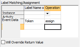
Thanks for the help, @jordan.johnson. I tried changing the newly-created Process Flows using the instructions above, but it still doesn't seem to plot correctly. Please see the revised model (note that I set it to run at max run speed to highlight the issue). Is there something else I should change? Also, I noticed that when clicking on the Exit Zone object and editing the token assignment via Quick Properties, there is a non-movable gray box named "Event Data" that appears to overlap the Label Matching/Assignment table, like this:
Thanks in advance for your help resolving these issues.
The charts do look empty. However, the chart axis y reports the correct value of 3600. I think this is a bug only when all y values are identical. I will make sure it gets on the dev list, to show the line when all y values are the same.
I can't get the Event Data overlap that you are seeing to happen, either in quick properties, or in the activity's properties window. Can you send a gif?
Thanks again, @jordan.johnson. Yes, if I change the Date Time source to vary over time, then yes it will plot correctly. Will the Process Flow fix you mentioned above also be added to the dev list, or should I send a separate email for that?
I did include a PNG of the overlap issue earlier... let me know if you don't see it and I can resend it. It looks like normally "Event Data" is shown in the upper-left corner, but for some reason it sometimes doesn't draw there correctly. I've tried reproducing the issue but it doesn't seem to happen consistently.

15 People are following this question.