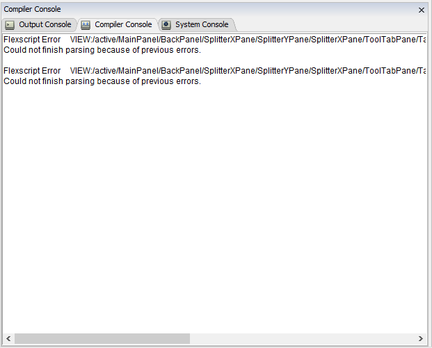
FlexSim error messages are relatively long because they include the full path to the node where the error happened. They typically look like this:

What's wrong? Scroll to the right to find out.
Roughly 112 characters fit the width of this pane and there is enough vertical space, but the most important information (what's wrong and where) is almost never visible. It takes almost two page-widths of horizontal scrolling to reach the informative part of the message.
The problems with this approach:
- long lines are hard to follow and don't help readability
- horizontal scrolling is widely considered bad for usability:
- it is not supported by a standard mouse wheel
- it is not supported by PageUp and PageDown buttons
- it requires licking precisely on the horizontal scrollbar and dragging it (might be difficult for some users)
- horizontal scrollbars take valuable vertical screen space
Proposals:
- Add an option to automatically wrap lines in console windows and make it the new default. Break lines at word boundary or after slash. Optionally: add line continuation symbol at the end and/or extra indentation on the continuation line to make it clear where the lines were broken.
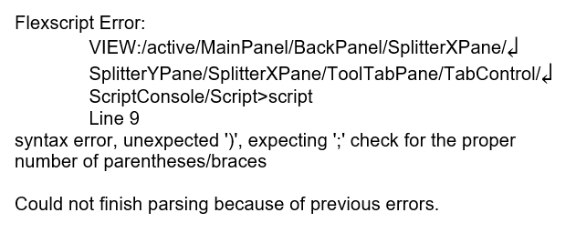
- Use multi-line format for error messages, so that the type of the message ("Flexscript Error"), location (node path and line number), the message itself ("syntax error..."), and the eventual result ("Could not finish parsing...") were clearly visible at the first glance. Optional: use a rich UI control like a table to present messages (see Visual Studio errors).
This is a mock-up of how formatted messages may look like to improve readability:

Maybe breaking nodepaths is not a good idea, because it interferes with copy-pasting. There are several solutions for this use case:
- wrap all lines, but don't break node paths (always break a line after a path)
- wrap node paths too, but don't insert extra line continuation characters (so copying still works)
- use a table or another rich UI control to present errors
Still it's usually more important to see the end of the path rather than the beginning. If the paths are displayed on a single line, it may be convenient to show the name of the node _before_ the full path: something like:
Flexscript Error in 'script', line 9:
VIEW:/[lots of text...]/Script>script
Syntax error: [whatever]
