Idea

Marco Baccalaro avatar image
7 Likes"
Marco Baccalaro suggested Marco Baccalaro commented

Dashboard Improvements

In our opinion, the following improvements on the Dashboards widgets, if possible to be implemented, should be useful:

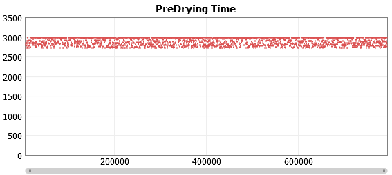
  1. On the Tracked Variable Time Plot widget is useful to fit the graph on y axis and, instead, to choose the minimum and maximum y shown. Otherwise, some graph is quite impossible to understand.


    Something similar is done on the Experimenter results graph:

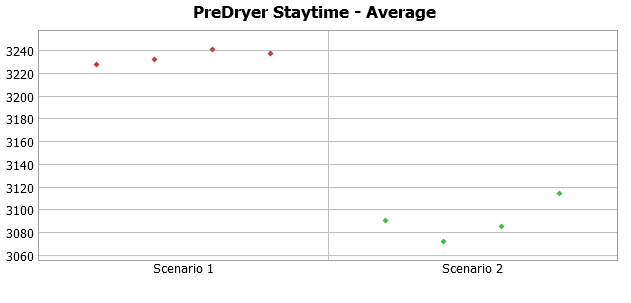
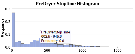
  2. On the Histogram, currently, we can only choose the number of bars. Should be useful to choose the interval length and so the starting and ending values otherwise sometimes we're not able to represent correctly our outputs:

  3. Could be also useful, on Histogram, to be chosen an automatic number of bars calculation trough an heuristic that changes the number of the bars based on the number the values of the dataset.
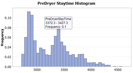
  4. On State Pie is possible to define the "Precision" of the data. It could be useful also to have a precision when hovering the graph with the cursor (like on an histogram). As an example, in this graph I cannot read the Frequency value:

  5. On Histograms we'd like to define the axis names (as in the Time Plot)
  6. Also in Histograms could be useful to collect data only into a time window

dashboard1.png (12.0 KiB)
dashboard2.png (8.0 KiB)
dashboard3.png (8.4 KiB)
dashboard4.png (6.9 KiB)
5 |100000

Up to 12 attachments (including images) can be used with a maximum of 23.8 MiB each and 47.7 MiB total.

2 Comments

·
Jordan Johnson avatar image
2 Likes"
Jordan Johnson commented Jordan Johnson edited
  1. 17.2 time plots have this feature (these plots can actually plot any x-y data; scale types on both x and y axis are determined by column formatting)
  2. 17.2 histograms have this feature
  3. No plan currently
  4. 17.2 charts use precision to show significant digits, so that small values are included, even at low precision
  5. 17.2 histograms have this feature
  6. In 17.2, you could use a condition in the Event Listening tab of the Statistics Collector, and only listen to events and record data if the time values are correct. Alternatively, you could use a Calculated Table to filter out data you don't want:
SELECT * FROM StatisticsCollector1 WHERE TimeColumn >= Model.getDateTime(3600) AND TimeColumn <= Model.getDateTime(7200)

I am going to mark this idea (which is really 6 ideas) as complete, and make a new idea for number three. That way, people vote for it individually.

5 |100000

Up to 12 attachments (including images) can be used with a maximum of 23.8 MiB each and 47.7 MiB total.

Marco Baccalaro avatar image
1 Like"
Marco Baccalaro commented

I don't know yet how to use the new statistics collector and the new Dashboard but I figured out that they permit much more flexibility and easy to use.

So thank you, great job!

5 |100000

Up to 12 attachments (including images) can be used with a maximum of 23.8 MiB each and 47.7 MiB total.

Write a Comment

Up to 12 attachments (including images) can be used with a maximum of 23.8 MiB each and 47.7 MiB total.

Your Opinion Counts

Share your great idea, or help out by voting for other people's ideas.

Related Ideas