question

Robert D avatar image
0 Likes"
Robert D asked Ryan Clark commented

State Bar Graphic interpretations

I ran 3 Flexsim cases - resulting in 5%, 44% and 67% (with the better solution being 5%). The Bar graph color red traces to 2 Metrics: 1) Releasing - 8, and the second 2) offset travel empty - 16. What does the metric mean?

FlexSim 21.0.0
flexsim 21.0.0data interpretation
· 1
5 |100000

Up to 12 attachments (including images) can be used with a maximum of 23.8 MiB each and 47.7 MiB total.

Ryan Clark avatar image Ryan Clark commented ·

Hi @Robert D, was @Eric M's answer helpful? If so, please click the red "Accept" button at the bottom of their answer. Or if you still have questions, add a comment and we'll continue the conversation.

If we haven't heard back from you within 3 business days we'll auto-accept an answer, but you can always unaccept and comment back to reopen your question.

0 Likes 0 ·

1 Answer

·
Eric M avatar image
0 Likes"
Eric M answered

Hi @Robert D there are a lot of different states that objects can be in throughout a model run (see here for a list). To get a better idea of what the states mean, you can look in the statistics panel of the properties of an object while the model runs. That way you can see what kind of activities correspond to which states. Pinning the stats to a dashboard is an easy way to keep the state visible while the model runs.

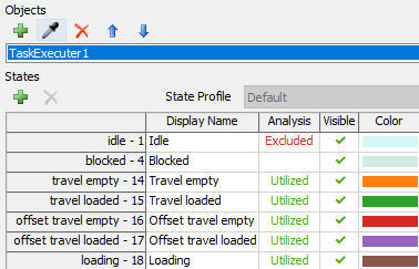
In the state chart, you can also look in the properties to see which states are being recorded. If there are states you don't want to include in the data, you can change the Analysis column to "excluded."

1628786159109.png


1628786159109.png (16.6 KiB)
5 |100000

Up to 12 attachments (including images) can be used with a maximum of 23.8 MiB each and 47.7 MiB total.

Write an Answer

Hint: Notify or tag a user in this post by typing @username.

Up to 12 attachments (including images) can be used with a maximum of 23.8 MiB each and 47.7 MiB total.