I have the next model: MultiSupplier.fsm I have created a statistics collector and a chart in the dashboard in order to analyse the results, but I would like to analyse more exact results, so is it possible to visualize the results in a table instead of the chart? I mean, I want to have a table where in a column I can see the time defined in the statistics collector and in another column the output defined also in the statistics collector.
question
Statistics Collector results in a table
FlexSim 22.1.4
multisupplier.fsm
(229.6 KiB)
Comment
0
1 Answer
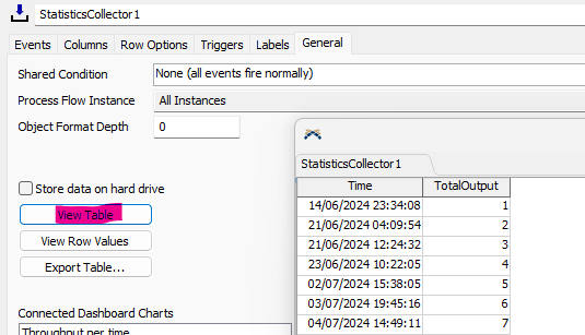
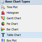
Either look at the table from the collector's properties (mostly as a one of, for example for debugging) or display it as a table chart.


capture1.png
(23.4 KiB)
capture2.png
(6.6 KiB)
0
question details
14 People are following this question.
