question

Noah Z avatar image
0 Likes"
Noah Z asked Jordan Johnson answered

How to change data split color on dashboard chart?

flexsim-question.png

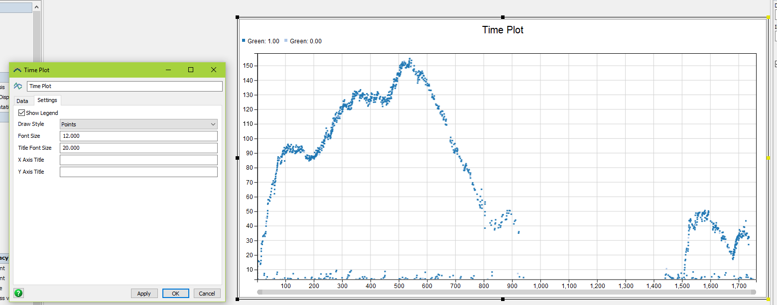
I'm trying to change the color of the points on a Time Plot where I have data split out by a label (see attached screenshot). However, there is no option that I can find to do this. The two colors that FS automatically chooses are blue and light blue so there is not enough contrast in the plot.

FlexSim 17.2.2
dashboard displaycolor selectionlegend
5 |100000

Up to 12 attachments (including images) can be used with a maximum of 23.8 MiB each and 47.7 MiB total.

1 Answer

·
Jordan Johnson avatar image
1 Like"
Jordan Johnson answered

In version 18.0 (now available as a beta), the Time Plot and Histogram charts both got a new Colors tab. The colors can be auto-assigned or specified by the user.

In previous versions, you could not change the colors.

5 |100000

Up to 12 attachments (including images) can be used with a maximum of 23.8 MiB each and 47.7 MiB total.

Write an Answer

Hint: Notify or tag a user in this post by typing @username.

Up to 12 attachments (including images) can be used with a maximum of 23.8 MiB each and 47.7 MiB total.