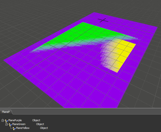
If you've ever tried to nest groups of objects inside a hierarchy of planes, you may find the drawing of the planes suboptimal and lacking information:
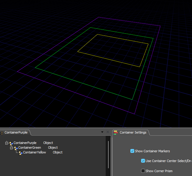
Using the container (modified plane) in the attached user library you can represent the container with just an outline. A settings dashboard is installed with the library along with some user commands and global variables.
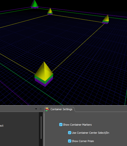
Corner prisms show the nesting layers under the prism:
The option 'Use the container center' allows you to use it as either a plane as before or, when unselected, a bordered frame where dropping an object or clicking and dragging within the borders will behave as though you are dropping onto or clicking/dragging the model floor. You can also choose to hide the containers entirely for the cleanest visuals.
I hope this will encourage users to use containers more, since when coupled with Templates and Object Process Flows they can increase the scaleability and make your developed assets more manageable.
( In those cases the container becomes the member instance of the process flow or template master and references to its components are made through pointer labels on the container rather than names which you may want to alter for reporting purposes. The pointer labels are updated automatically when creating a new instance of the container.)
If you want planes you already have in your model to adopt this style just add this to their draw code:
- return containerdraw(view,current);


