Idea

Gui Vaccaro avatar image
2 Likes"
Gui Vaccaro suggested Gui Vaccaro commented

Distinguish node icons according to their "position" in the object tree

Hello,

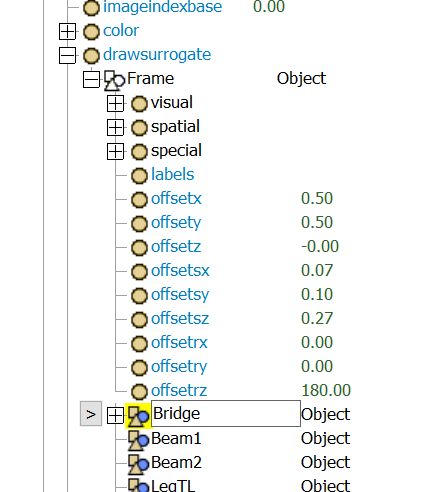
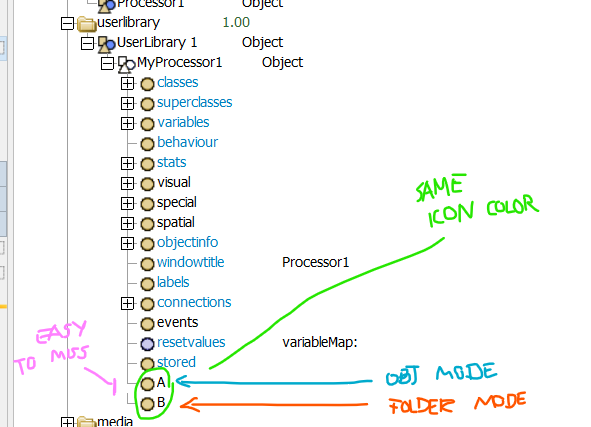
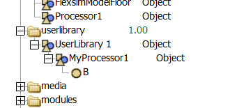
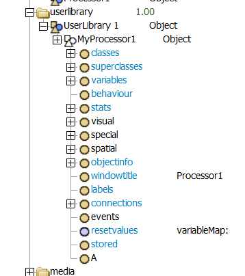
currently the tree uses different icons for objects, code nodes, and general nodes. However, as objects have two "modes" (i.e. a "folder" node - colorful - and "object property" - grayed), sub-nodes will have different behaviors depending on which mode they were created (e.g. "dropscript" does not execute if placed under an object in the "folder" mode, which is appropriate, but can be overseen by an user).

It would help to have a visual distinction for the sub-nodes in this case, to facilitate modeling and error reduction.

This also would help users to understand better the syntax required "/" or ">" when accessing nodes.

Thank you.

objectnodesmodelingicon
5 |100000

Up to 12 attachments (including images) can be used with a maximum of 23.8 MiB each and 47.7 MiB total.

1 Comment

Joerg Vogel avatar image
0 Likes"
Joerg Vogel commented

Gui, > is a direct visual sign in tree view, when you mark an object node. objects-in-attribute-tree.jpgIf you highlight a node, copy it by shortcut or right mouse button menu and then you paste it in a script window or any other editor you get a complete path from Model root node.

· 5
5 |100000

Up to 12 attachments (including images) can be used with a maximum of 23.8 MiB each and 47.7 MiB total.

Gui Vaccaro avatar image Gui Vaccaro commented ·

Hi, @Joerg Vogel ,

thank you, but this is not what I meant. Please see the pictures below:

1738260357184.png


1738260348615.png

1738260390763.png

1 Like 1 ·
1738260348615.png (10.1 KiB)
1738260357184.png (55.4 KiB)
1738260390763.png (21.8 KiB)
Joerg Vogel avatar image Joerg Vogel Gui Vaccaro commented ·
Node A is an attribute Node of MyProcessor1 (top level)

Node B is subnode of object MyProcessor1

The small gap distinguishes between attribute tree > and object subtree /

0 Likes 0 ·
Gui Vaccaro avatar image Gui Vaccaro Joerg Vogel commented ·
Hi, @Joerg Vogel ,

precisely. It would be simpler for users / customers if those had a slightly different signature, so they still can convey their nature (circles, shapes, etc.) but visually be distinct. This is a suggestion for software improvement based on best practices of user friendliness and clarity.

Thank you for stating clearly the meaning of each node. The only part missing in my suggestion is adapting the icons.


0 Likes 0 ·
Show more comments

Your Opinion Counts

Share your great idea, or help out by voting for other people's ideas.