Idea

Clair A avatar image
12 Likes"
Clair A suggested Clair A edited

How to improve 20.2 quick properties window ?

In FlexSim 2020 Update 2, developpers have added a new Quick Properties window that appears next to your cursor when double clicking an object:

Here is an idea that I shared with @jordan.johnson:

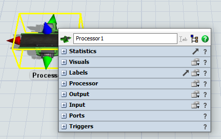
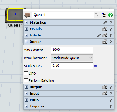
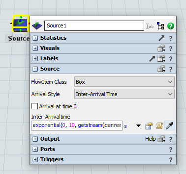
Expand by default the section showing the parameters of this object's class.

Please find below examples of this idea for some objects:

Processor

Queue

Source

I think that this would help beginners to quickly find the most important settings when double clicking an object.

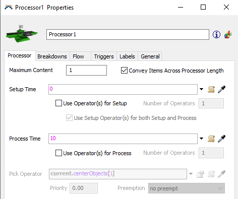
I also think that this would help users migrate from 20.1 to 20.2. Since in most cases the default expanded section in 20.2 would actually show the same parameters as the 1st tab of the 20.1 properties window.

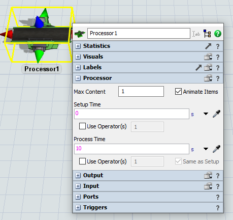
For example in 20.1 the 1st tab of a Processor properties was showing the setup & process times:

So in 20.2 the Processor section could be expanded by default to quickly show the setup & process times:

You can vote for this idea if you think this would be an improvement, or also comment below.

properties window20.2
image.png (35.7 KiB)
image-1.png (49.0 KiB)
image-2.png (27.3 KiB)
image-3.png (27.9 KiB)
image-4.png (26.3 KiB)
image-5.png (49.0 KiB)
5 |100000

Up to 12 attachments (including images) can be used with a maximum of 23.8 MiB each and 47.7 MiB total.

Phil BoBo avatar image
3 Likes"
Phil BoBo commented Clair A edited

With regards to your comment "I think that this would help beginners to quickly find the most important settings when double clicking an object":

Beginners shouldn't even be double-clicking on objects to find settings anymore. All of the setting are available on the Properties pane when you single-click on an object.

You should not be training your beginner users to double-click on objects at all anymore. The Quicker Properties popup that appears when you double-click is a shortcut for experienced users. For beginners, you should be using the Properties pane.

If you are struggling with the muscle memory of automatically double-clicking on objects to edit their properties, perhaps you should try using the attached module (NoQP.zip) to disable the Quicker Properties popup window.

That will make FlexSim 20.2 work like FlexSim HC 5.3 where all the settings were in properties and double-clicking objects did nothing.

Perhaps using this module for a while will help you adjust to using the Properties window instead of the Quick Properties popup shortcut window. Then, when you want it to behave consistently and you are ready to work with the shortcut popup window as you do in ProcessFlow, you can get rid of the module and use the interface as it is now designed.

· 1
5 |100000

Up to 12 attachments (including images) can be used with a maximum of 23.8 MiB each and 47.7 MiB total.

Clair A avatar image Clair A commented ·

> You should not be training your beginner users to double-click on objects at all anymore.

That's exactly what I have done so far in my trainings on 20.2. I encourage users to edit properties in the right pane. However, some users still intuitively double click on objects.

For users who always use the right pane, there is another drawback: they spend a lot of time stucked in the bottom right corner of their screen. Not everybody has a large screen and can display all the properties in the right pane without scrolling all the time.

In previous versions, the properties window allowed to work cumfortably in the center of your screen, or anywhere else you wanted to drag that window.

0 Likes 0 ·
David Seo avatar image
1 Like"
David Seo commented Ben Wilson edited

And also the new property window should be able to be moved by drag and drop.

· 1
5 |100000

Up to 12 attachments (including images) can be used with a maximum of 23.8 MiB each and 47.7 MiB total.

Ben Wilson avatar image Ben Wilson ♦♦ commented ·

I found that if you double click and quickly move your mouse, the new properties window will open at the new mouse position. Not what you're looking for, but maybe a workaround of sorts.

1 Like 1 ·
Matthew Gillespie avatar image
1 Like"
Matthew Gillespie commented

We tried doing this, but decided we didn't like it. The main issue is that expanding the object's "default" panel causes panels to be opened inconsistently and it felt annoying to have unwanted panels expanded.

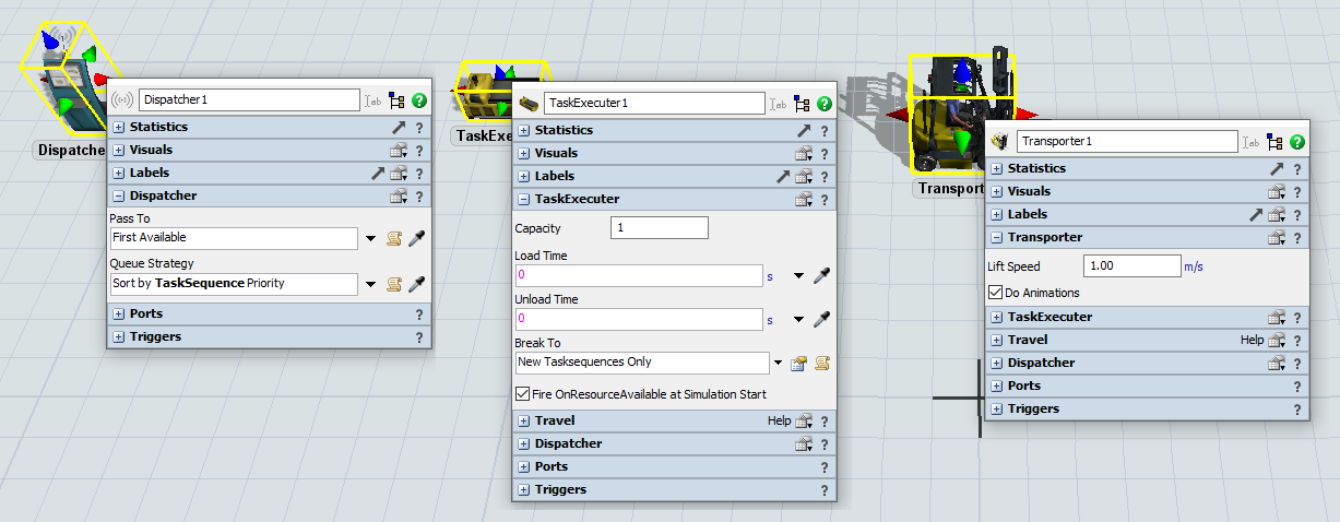
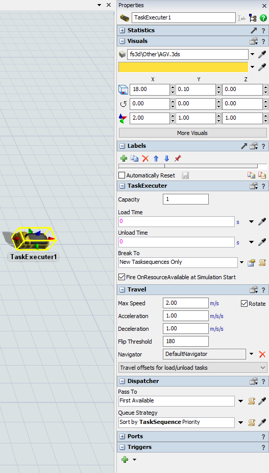
For example, if you click on these objects in the order Transporter > TaskExecuter > Dispatcher, then the properties open with only the "default" panel open - just like you wanted.
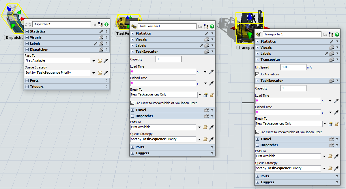
However, if you click on them in the opposite order you get expanded panels carrying over. The Task Executer properties has its "default" panel open and it has the Dispatcher panel open. The Transporter now has 3 panels open.

You almost never want to see the Dispatcher panel unless you're clicking directly on a Dispatcher object. However, if you ever open the properties of a Dispatcher object it will pop open that panel (even if you just wanted to rename it) and it will stay open on other TE objects until you manually close it.

In the end we decided it was a better user experience to let the user decide when they wanted to expand and collapse panels. If you really want the Dispatcher panel open on all the TE objects then you can go ahead and expand it yourself.

· 8
5 |100000

Up to 12 attachments (including images) can be used with a maximum of 23.8 MiB each and 47.7 MiB total.

Clair A avatar image Clair A commented ·

Thanks for your feedback @Matthew Gillespie.

Actually what you have tried is not exactly the idea that I share in this post:

"Expand by default the section showing the parameters of this object's class"

What you have tried is:

"Expand by default the section showing the parameters of this object's class AND expand any similar panel that was previously expanded, no matter in which object's class"

I agree with you, this behavior is much less convenient.

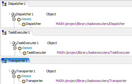
Back to your example, the Dispatcher, the TaskExecuter and the Transporter don't belong to the same class:

If the Dispatcher panel was previously expanded on a Dispatcher object, why should it also be expanded on a TaskExecuter object ? I agree with you that it does not make sense, since these 2 objects don't belong to the same class, so we don't focus on the same properties.

0 Likes 0 ·
capture.png (12.5 KiB)
Phil BoBo avatar image Phil BoBo ♦♦ Clair A commented ·

The Quick Properties popup is the same window shared for every object. Depending on the object's class, different sections will be shown.

It remembers which sections were expanded or collapsed as you bring it up multiple times.

You are proposing that it collapse all those sections and expand just 1 section depending on the object class you double-clicked on?

You want it to not remember what sections were expanded?

0 Likes 0 ·
Clair A avatar image Clair A Phil BoBo ♦♦ commented ·

If I double click on a Source, the Quick Properties popup should expand the same sections that were expanded the last time I opened the properties of a Source.

If I double click on a TaskExecuter, the Quick Properties popup should expand the same sections that were expanded the last time I opened the properties of a TaskExecuter.

Have you tried this: remember what sections were expanded by object's class ?

If you have a module for it, we can test it and give you our feedback.

0 Likes 0 ·
Show more comments
Clair A avatar image Clair A commented ·

> You almost never want to see the Dispatcher panel unless you're clicking directly on a Dispatcher object.

I fully agree with you @Matthew Gillespie.

But currently in the right pane the Dispatcher panel is expanded by default when you click on a TaskExecuter, a Transporter, an Operator...

I think it's better to keep the Dispatcher panel expanded by default for the Dispatcher only, and collapse it by default for other objects.

0 Likes 0 ·
1602522592957.png (78.9 KiB)
Phil BoBo avatar image
1 Like"
Phil BoBo commented

Attached (ExpandQP.zip) is a module that adds this functionality to the standard objects (for simplicity, it doesn't affect module objects).

At first, it seems like an improvement when you are just clicking on objects without actually trying to work with this change.

Eventually, as you work with it on real models trying to accomplish real UI tasks, it feels weird, confusing, and annoying.

As Matthew explained, we tested with this during development and ultimately decided that simply remembering what the user expands and collapses themselves worked out as a better interface. Trying to expand and collapse tabs automatically for you ended up being more annoying than simply letting you click on the panels you want yourself.

· 2
5 |100000

Up to 12 attachments (including images) can be used with a maximum of 23.8 MiB each and 47.7 MiB total.

Phil BoBo avatar image Phil BoBo ♦♦ commented ·

Maybe if other people try it out, they'll feel differently about it. Try using the module for a while and let us know what you think.

0 Likes 0 ·
Clair A avatar image Clair A Phil BoBo ♦♦ commented ·

Thanks for sharing this module @Phil BoBo. I have tried it and I agree with you: it's not convenient because it also expands any similar panel that was previously expanded, no matter in which object's class. That's why I think it could be an improvement to remember what the user expands and collapses for each object's class.

0 Likes 0 ·
Jason Lightfoot avatar image
1 Like"
Jason Lightfoot commented Jason Lightfoot edited

I would like to see some indication in the collapsed view (an asterisk, maybe) as to which parameters no longer have the default values so that I can then just expand the ones that are relevant to the purpose (reviewing or adding)

5 |100000

Up to 12 attachments (including images) can be used with a maximum of 23.8 MiB each and 47.7 MiB total.

Boris V2 avatar image
1 Like"
Boris V2 commented Clair A edited

For me, the main problem is that we cannot easily compare the objects between them or browse them easily ...

· 1
5 |100000

Up to 12 attachments (including images) can be used with a maximum of 23.8 MiB each and 47.7 MiB total.

Clair A avatar image Clair A commented ·

Hi @Boris V2,

I recommend to use Property Tables:

Property tables are a tool you can use to better visualize and change the properties of objects in your model: https://docs.flexsim.com/en/20.2/Reference/Tools/PropertyTables/

1 Like 1 ·

Your Opinion Counts

Share your great idea, or help out by voting for other people's ideas.

Related Ideas