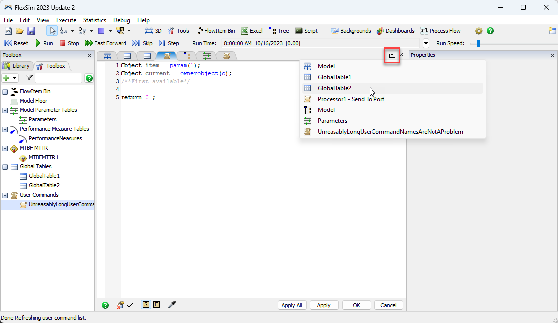
Currently, if you have many windows open (processflows, commands, tables, etc.) and the width exceeds the window width, then names are removed to only leave the icons. I suppose the idea is then to use the dropdown menu on the side to select the correct tab when switching. I would personnally prefer it if the tabs go stacked, so I could still find the correct one without having to use the dropdown menu.
Example: I have some windows open:
And I open another thing, then it becomes like this:
But I would prefer it as follows (excuse my paint skills):
Maybe some people prefer it as it is now, so perhaps it could be a checkbox option in the preferences somewhere?


