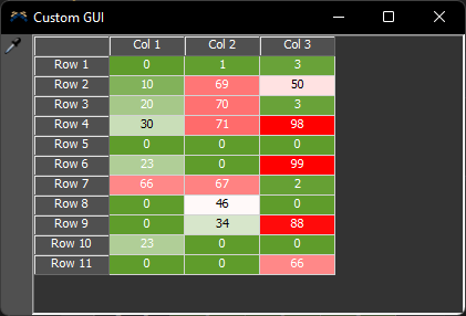
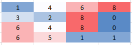
Hello @Stan Davis,
You can export your data to Excel and easily add a heat map like this. I do not believe that the cells in a table chart or global are able to add color to them.
Yes (the pic is from Excel), but I need to see the data in real 'sim' time and not as a post analysis. I mentioned Table Chart, but I am looking for any ideas on how to emulate a Heat Map with the existing toolset. I am going to request a Dashboard Heat Map be added to FlexSim's features/capabilities. - Stan
In the meantime Stan, I'm attaching a model with two CustomGUIs that you can point to global tables using the sampler and change the color using the "HeatPallet" color pallet. The global variable maxHeat sets the top threshold.
To open this just right click the "HeatTable" objects in the Toolbox section marked "Graphical User Interfaces" and select "Show GUI". To switch the table use the sampler to select from the list of tables in the toolbox.
The two examples use a different technique to set the background color.
Update: it seems the attributes needed are documented here.
would it be possible to attach the corresponding model?
Thank you,
Martin
18 People are following this question.
FlexSim can help you understand and improve any system or process. Transform your existing data into accurate predictions.
FlexSim is a fully 3D simulation software environment. FlexSim can be used to simulate any process in any industry.
FlexSim®, FlexSim Healthcare™, Problem Solved.®, the FlexSim logo, the FlexSim X-mark, and the FlexSim Healthcare logo with stylized Caduceus mark are trademarks of FlexSim Software Products, Inc. All rights reserved.
Privacy | Do not sell or share my personal information | Cookie preferences | Report noncompliance | Terms of use | Legal | © 2025 Autodesk Inc. All rights reserved