Hi:
I have a throughput by Type bar chart. And I want to show the different color bar charts for various types, like the one below. 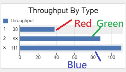
Can I do it? The flexsim program is attached.
Hi:
I have a throughput by Type bar chart. And I want to show the different color bar charts for various types, like the one below. 
Can I do it? The flexsim program is attached.
Install the chart components and change the Data Format to One bar per row. This will allow you to define a column that controls the bar color.
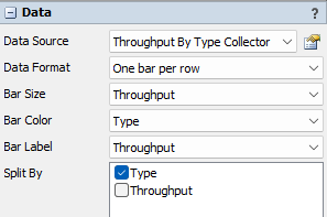
Hi:
I installed the Data and got the Throughput By Type Collector. However, when I used the collector, I discovered a difference between yours and mine. Mine missed the Bar Size and Bar Color, as shown below.
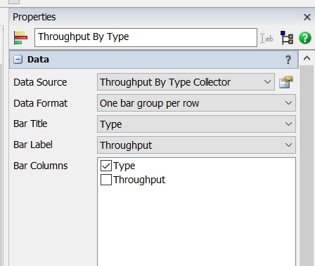
Second, the color tab cannot allow me to delete the Type option, as shown below.
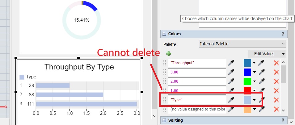
My flexsim program is attached.
Oops, I should have corrected my mistake. Now it works. I slip the notice of One bar per row. The correct program is attached. Thanks.
13 People are following this question.
FlexSim can help you understand and improve any system or process. Transform your existing data into accurate predictions.
FlexSim is a fully 3D simulation software environment. FlexSim can be used to simulate any process in any industry.
FlexSim®, FlexSim Healthcare™, Problem Solved.®, the FlexSim logo, the FlexSim X-mark, and the FlexSim Healthcare logo with stylized Caduceus mark are trademarks of FlexSim Software Products, Inc. All rights reserved.
Privacy | Do not sell or share my personal information | Cookie preferences | Report noncompliance | Terms of use | Legal | © Autodesk Inc. All rights reserved