question

GRodea avatar image
0 Likes"
GRodea asked GRodea commented

Is it possible to graph in a dashboard a performance measure table?

HEllo,

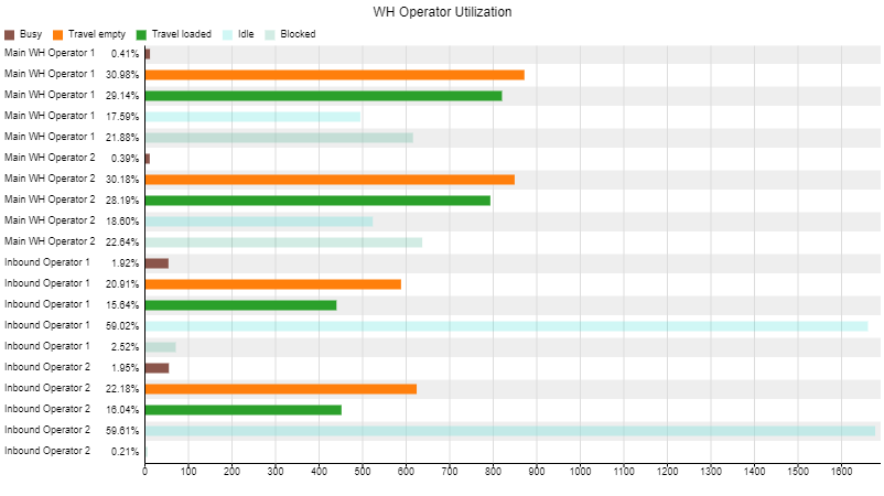
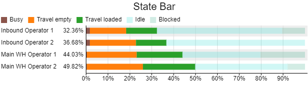
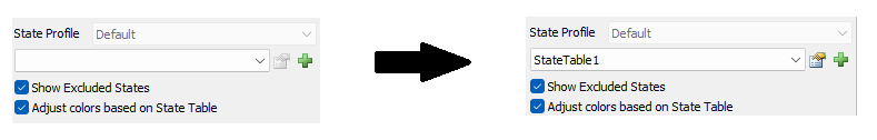
I am trying to gather the information from the States from the operators in a way I can see which percentage they are Idle/Block/travelling. In a previous question, it was suggested to get the values via Performance Measure and it seems to be working, but my customer is requesting a graph to show them and understand them easier. How can it be achieved?WH model.fsm

FlexSim 23.2.1
performance measuresdashboard datagraphs
wh-model.fsm (419.9 KiB)
· 7
5 |100000

Up to 12 attachments (including images) can be used with a maximum of 23.8 MiB each and 47.7 MiB total.

1 Answer

Felix Möhlmann avatar image
1 Like"
Felix Möhlmann answered GRodea commented

Having the percentage numbers as an overlay on top of the bars is not possible in FlexSim. (At least not without developing a custom chart from the ground up, I think).

The closest I can offer is to split the bars up and show the percentage as the header. This would allow you to plot the total time on the x-axis to convey as much information as possible in the chart.

1694782018287.png

wh-model_1.fsm

Or is this all just a misunderstanding and what you are after is the chart below, but you couldn't get it to work, because you ran into the bug where the State Table field is not automatically assigned a value when adding the chart?

1694782148720.png

capture1.png

· 1
5 |100000

Up to 12 attachments (including images) can be used with a maximum of 23.8 MiB each and 47.7 MiB total.