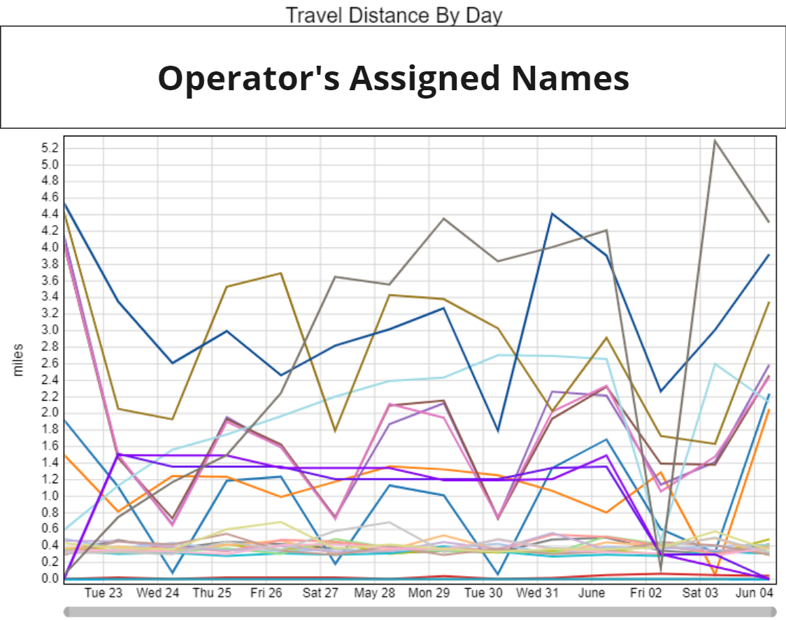
I've run my model, and I've noticed that the traveling distance chart displays as follows:
- Firstly, I'm curious about why some operators' traveling distances start at such high numbers, like 4.5 miles. Shouldn't they all begin from 0, given that the x-axis represents time?
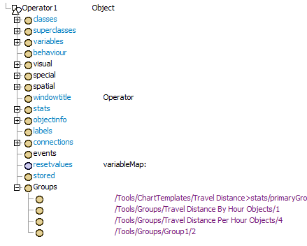
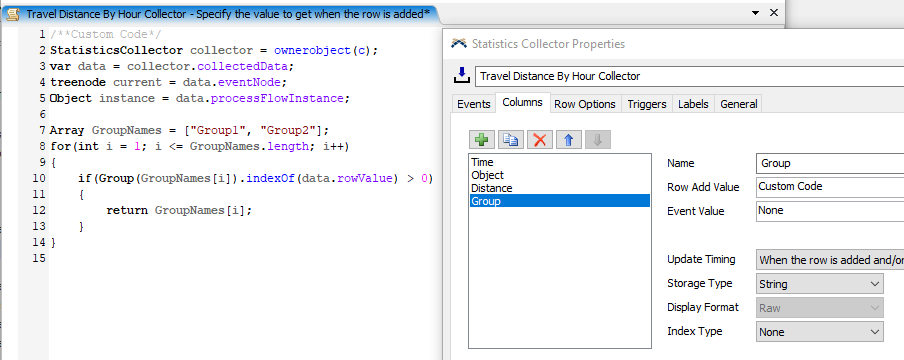
- Second, I'm wondering how I can group operators who belong to the same resource group. I remember this was possible in the HC environment, but I'm uncertain about how to do it in the General environment.
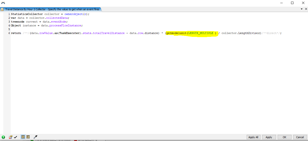
- Third, I've observed that there doesn't appear to be any significant difference between the Travel Distance Chart and the Travel Distance per Hour chart. In fact, in some runs, I've even seen higher values for the latter. Can anyone clarify how the travel distance per hour is calculated?


