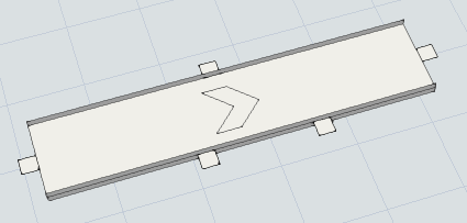
In the 3D view, entry and exit transfers are drawn with the same shape: a white square.
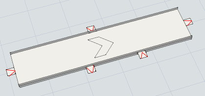
As a result, when you have several entry and exit transfers along a conveyor it's not always obvious which white squares are entry transfers and which ones are exit transfers:
It would be helpful if users could see the difference between entry and exit transfers at a glance.
For example, draw an arrow on the transfer showing the flow direction:


