Idea

Serge A avatar image
3 Likes"
Serge A suggested Phil BoBo edited

[20.2 Beta] Object "properties" need a consistent way to be kept open

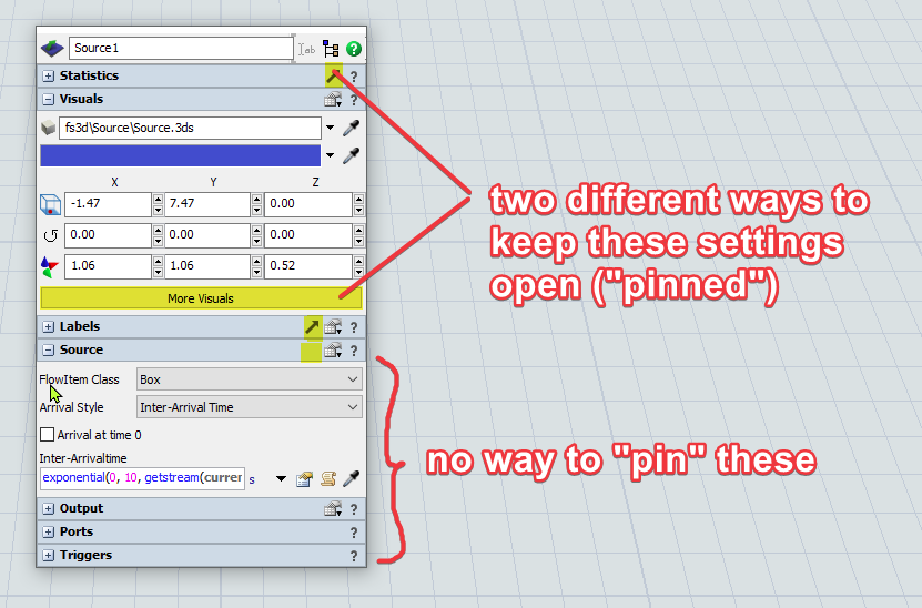
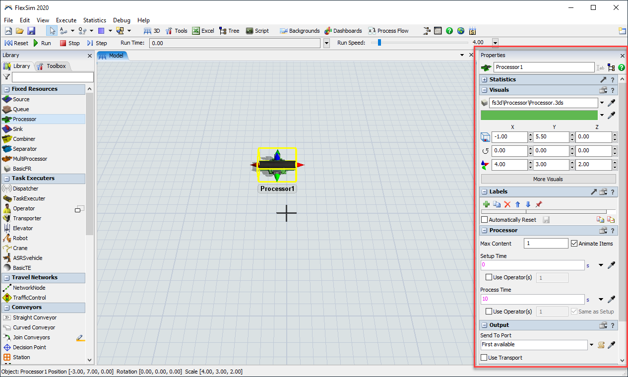
The new way to display object properties is inconsistent in how it allows / or not allows to keep some of the settings permanently visible.

- Statistics and Labels have a "Pop out" button

- Visuals have a hidden "More Visuals" button which achieves more or less the same

- Object-specific tab (Source), Input, Output, Ports, and Triggers don't have any way to be kept open

I suggest to

1) Show "Pop-out" button in all sections.

2) Offer an option to keep the entire panel open for as long as necessary until it is closed manually.
This feature is especially important when object properties have to be discussed with a client, in teaching contexts, or to provide support remotely.

betauiusabilityflexsim 20.2
1595262579700.png (77.8 KiB)
5 |100000

Up to 12 attachments (including images) can be used with a maximum of 23.8 MiB each and 47.7 MiB total.

Phil BoBo avatar image
5 Likes"
Phil BoBo commented Phil BoBo edited

All of the objects' properties are available in the Properties pane on the side when you click on an object:

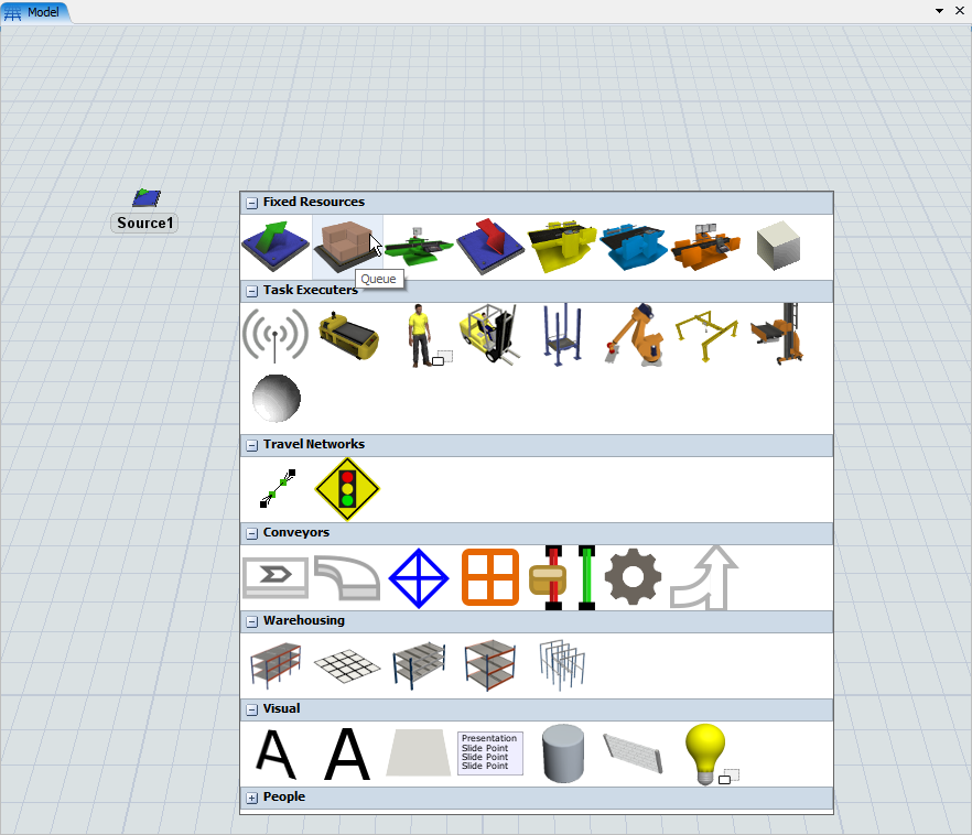
The pop-up window that appears when you double-click on an object is a shortcut way of editing an object's properties without dragging your mouse across the screen. This is similar to the Quick Library pop-up that appears when you double-click on empty space in a 3D, Process Flow, or Dashboard view:

The primary purpose of the properties change is for consistency and usability. Our overarching goal with these changes was to bring consistency between how you edit objects in the software. Previously, different objects were modified differently. For example, a Processor, an AGV path, and a Delay activity all had their properties in different windows that you accessed differently. Now, you edit each of those objects the same way as any other object in FlexSim, and their windows all have a similar look and feel.

"When object properties have to be discussed with a client, in teaching contexts, or to provide support remotely." All of these use cases can be done with the Properties pane on the side. None require you to use the Quick Properties popup.

The Statistics and Labels panels are the output windows that are available to pop out into their own dockable windows for viewing multiple at the same time. The other panels are input parameters for the object.

Also, we added Property Tables that can be used for comparing and editing multiple objects at the same time in a nice tabular view.

Not being able to permanently keep open a top-level properties window also prevents bugs that often happened with the old Properties windows when they were left open and the objects were modified elsewhere, such as moving them in the 3D view, renaming them in the tree, or using Edit Selected Objects. Disallowing the properties window from being open all the time helps prevent bugs caused by having multiple places to edit the same variables at the same time.

5 |100000

Up to 12 attachments (including images) can be used with a maximum of 23.8 MiB each and 47.7 MiB total.

anthony.johnson avatar image
4 Likes"
anthony.johnson commented

When we designed the new property system, we specifically decided not to include the ability to have popouts for panes that are inputs into the model. Allowing popouts creates bugs because users can have two input windows for the same object open at the same time (the popout input window, plus the double-click window or the properties window panel). When two input windows for the same properties of the same object are open, it creates synchronization bugs where one input changes it but the other input doesn't properly update, and can therefore potentially undo what the user changed. Other issues arise when running the model with the windows open. If the property somehow dynamically changes, again you have a window that's not updated properly, and can undo what was changed.

We specifically made exceptions to this rule for windows that are providing live state information, like the statistics pane, and labels. Statistics does not have any input controls, so it does not have the synchronization issues, and labels updates immediately with the table view repaint, so it also doesn't have those issues. As for the visuals panel, the only overlap with those windows is in the color and the shape path (and maybe we should take those out).

In reviewing other standard software, it is very hard to find a precedent for such loosely managed input windows. In office applications like word, you define properties through a single input control on the ribbon. In some cases you can define properties through a popout dialog, but those windows are almost always modal dialogs, meaning you must close the dialog before interacting with anything else. I'm also pretty sure that 3D applications like Unity don't even provide the quick near-cursor property access that FlexSim provides.

The current properties system brings the interface more inline with the way the UI has worked in process flow from the beginning. Yet we have heard few complaints, if any, about doing the same types of things for process flow activities.

We also specifically created property tables so that users can view and compare properties across multiple objects. This is, in my opinion, a much better interface for comparing, and updating, object properties, than the previous method of opening a million windows and placing them side-by-side. With property tables, you can have a persistently open window where you can see object properties of not just one, but multiple objects.

· 7
5 |100000

Up to 12 attachments (including images) can be used with a maximum of 23.8 MiB each and 47.7 MiB total.

Serge A avatar image Serge A commented ·

@phil.bobo @anthony.johnson Thank you for the detailed explanation. I understand your technical reasons. And frankly, Properties dialogs had to be dealt with anyway because Cancel/Apply/OK didn't work as they normally should (some changes were applied immediately, some only on Apply).

But as the new UI is being developed there will be many opportunities to improve UX but also to make it worse. I will try to post specific suggestion and notes on how to make it better. It feels like the current iteration has some space for improvement.

As for the concurrent updates, I believe that the issue is still present. Like there is still concurrency between Code Editor and the quick edit panel. Hiding one of the UI elements (like closing the quick edit panel or the properties panel) does help to hide the issue, but doesn't solve it completely. I believe that the editors (properties dialogs, code editor, etc) should remember the state or the hash of object the state before modification, or the time of the last modification, and do not overwrite it if the object or the node has changed.

It would also help to disable editing while the simulation is running and the state of the objects is likely to be changed dynamically. You already disable deletion of some objects if the simulation is running. I think this approach can be extended also to properties dialogs (disable edits while running, re-enable on Stop/Reset).

1 Like 1 ·
Joerg Vogel avatar image Joerg Vogel commented ·

I can not move the properties windows like a pane. But I can resize it in such a way, that the window is placed at a different position on the screen. The size is stored but not the last location on the screen.

0 Likes 0 ·
anthony.johnson avatar image anthony.johnson ♦♦ Joerg Vogel commented ·

If you want a stationary location to place properties, use the properties pane on the right, and/or move it to the left pane. The double-click properties is specifically there so you can get quick access to an object's properties right next to your cursor.

1 Like 1 ·
Joerg Vogel avatar image Joerg Vogel commented ·

I can choose to put visual property of an object in one of already created tables or a new table. But the object data is present in all open tables. I am not able to build a own structure of different table properties.

0 Likes 0 ·
anthony.johnson avatar image anthony.johnson ♦♦ Joerg Vogel commented ·

If you're talking about property tables, you can add or remove columns as much as you like, as well as filter and sort the table as needed. The buttons in an object's properties window to create/view in a property table are just templates. Once a property table is created, you can customize them as much as you like from within the property table window. If it's not already in the beta, there will be a right-click option to remove a column. You can also use the columns button on the left (the button that shows multiple lines in columns) to define more or less columns to show.

0 Likes 0 ·
Joerg Vogel avatar image Joerg Vogel anthony.johnson ♦♦ commented ·

@anthony.johnson, yes, I found this feature at the table. There is a different feature at the new properties windows style that let me assume I could add labels from an object to an already created property table. But this doesn’t work.

If I add another label to a property table, I must write the labels name into the add field. There isn’t a menu I can choose a label from or use a sampler tool to achieve this easily.

0 Likes 0 ·
Show more comments
Michael Kramer avatar image
0 Likes"
Michael Kramer commented Phil BoBo edited

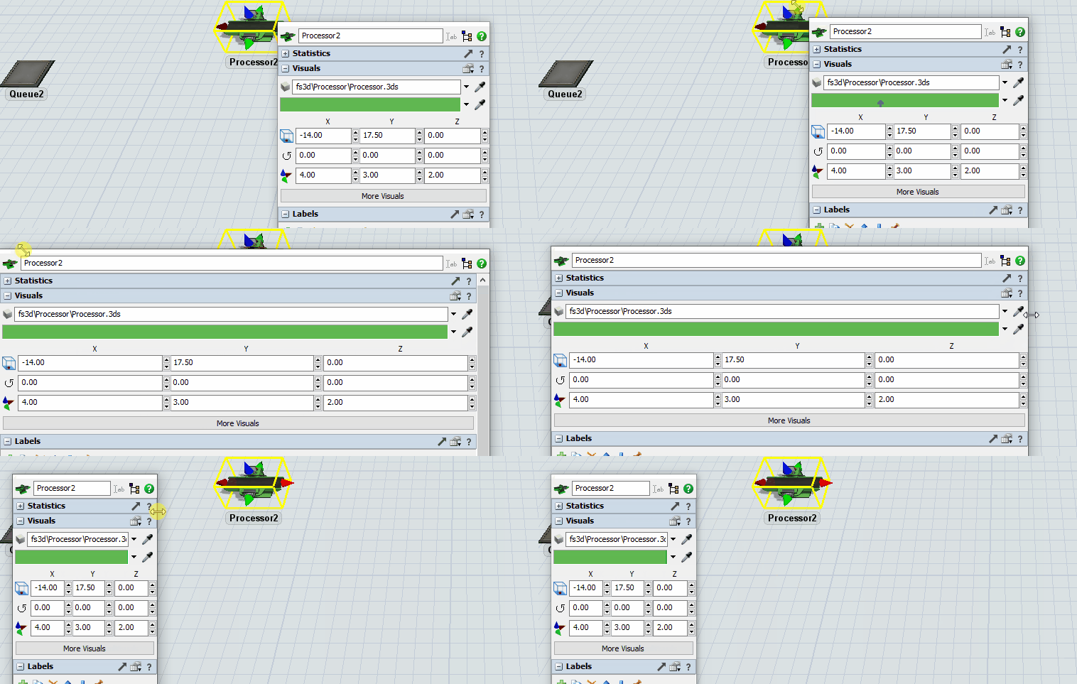
I'm using 2 monitors and when I open an object property window it goes over to the second monitor (to the right in this case) and I can't access the window on the right or bottom to resize. If I open and close the sections of the property window (hit + and -), eventually the window scoots to the left where I can finally access the bottom right corner of the window.

Honestly, this change has cause a lot of lost time and frustration, this kind of stuff needs to be worked out prior to release. Now I have models updated to 20.2 and I'm spending a lot of time trying to just get the property window correctly resized so I can see things like the list of triggers at the bottom. Before I could move the window and pull it where I wanted to see all the triggers, for example, now it's just a mess.

V20.1.3 vs. V20.2.zip

· 6
5 |100000

Up to 12 attachments (including images) can be used with a maximum of 23.8 MiB each and 47.7 MiB total.

Matthew Gillespie avatar image Matthew Gillespie ♦♦ commented ·

@michael.k5

Sorry for the frustrating experience.

Thank you for the videos showing these issues. We will improve the triggers popup for the next bug fix release so that it resizes and stays on the screen.

The property window should not be extending off the screen or moving when you expand and collapse panels.

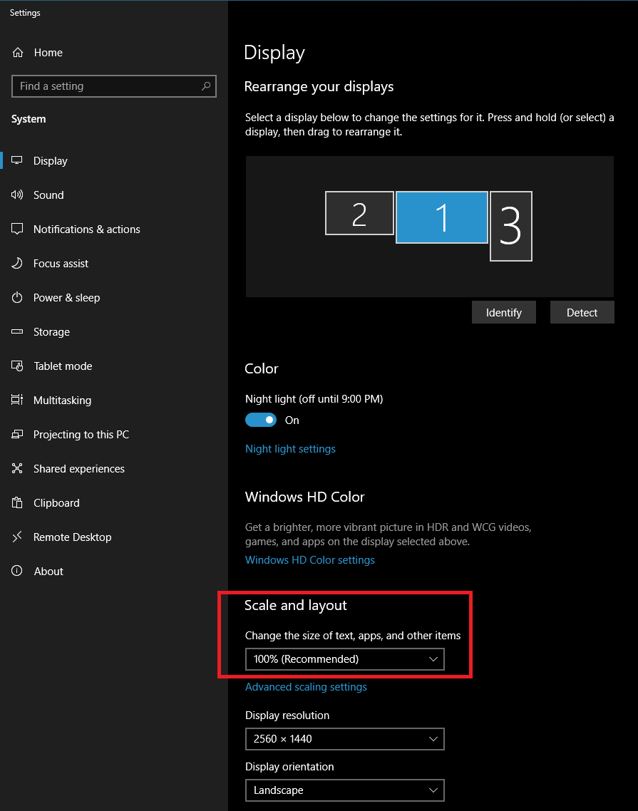
Could you tell us more about your Windows "Display settings"? Right-click the Windows desktop and select "Display settings" to open the window. Please post a screenshot showing the monitors and their positions. Also let us know which monitor is the main monitor and what the "Scale and layout" size percentages are for each monitor.

For example, here is a screenshot showing this information on a coworker's computer, monitor 2 is the main monitor, and both monitors are at 100% size scaling:


1 Like 1 ·
Michael Kramer avatar image Michael Kramer Matthew Gillespie ♦♦ commented ·

Matthew, attached are the display settings.

Also, I cannot run video in the FlexSim program, it always asks me to resize to 100%. I had a script I ran sometimes to resize the display but it doesn't work anymore, so I don't capture videos. I have SnagIt, but it doesn't capture the displays properly.


Laptop Display Settings.pdf

FlexSim Record Video Message.png

0 Likes 0 ·
Matthew Gillespie avatar image Matthew Gillespie ♦♦ Michael Kramer commented ·

@michael.k5

Thanks. Could you give us the display settings for your second monitor too?

In order to run the video recorder you need to change the monitor's scaling to 100%. You can do this on that Display settings window you sent a picture of. After you change the monitor scaling to 100% do you still see the issue with the jumping property window?

0 Likes 0 ·
1597332581576.png (78.5 KiB)
Show more comments
Show more comments

Your Opinion Counts

Share your great idea, or help out by voting for other people's ideas.