Idea

Mischa Spelt avatar image
4 Likes"
Mischa Spelt suggested Mischa Spelt commented

Option to show histogram bin center

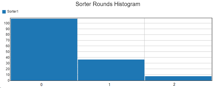
I have a histogram which shows the distribution of an integer variable. I can show that with bin width 1 and offset 0, but then it is not entirely clear if the first bar is value 0 or value 1:

1638437808166.png

So I gave it an offset of -0.5 and then the axis values become weird:

1638437834768.png

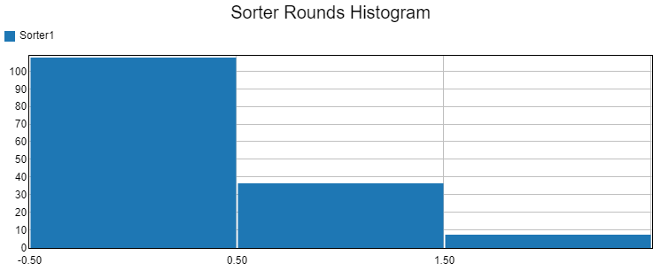
Is it possible to add an option that allows me to use the value around which the bin is centered as the tick mark, aligned to the center of the bar?

1638437933423.png


dashboardsfeature requesthistogram
1638437808166.png (9.1 KiB)
1638437834768.png (9.1 KiB)
1638437933423.png (9.1 KiB)
5 |100000

Up to 12 attachments (including images) can be used with a maximum of 23.8 MiB each and 47.7 MiB total.

1 Comment

·
Jordan Johnson avatar image
1 Like"
Jordan Johnson commented

Isn't this a case for a bar chart, rather than a histogram? The bars on a bar chart show data for a discrete value (like 0, 1, or 2). The bar char will show the discrete value for each bar, aligned clearly next to each bar. The bar chart doesn't place the bars on a continuous axis, because the data is discrete (although the size of the bar can be continuous).

1638483573498.png

In contrast, the bars on a histogram show the total number of values within a range; that range is defined by two values. The bars can be placed on a continuous axis, because the data involved could have any value. The axis tick marks show the boundary between buckets.

· 3
5 |100000

Up to 12 attachments (including images) can be used with a maximum of 23.8 MiB each and 47.7 MiB total.

Mischa Spelt avatar image Mischa Spelt commented ·

Hi Jordan, thanks for your reply. I can understand that maybe in this case a bar would also be appropriate, however I have two follow-up comments.

1. Would you consider at all the option to show the center of the bin as the tick value, rather than the boundaries? Perhaps this would have merit in and of itself, regardless of whether my example is a correct use case?

2. I have a few issues with the bar chart in this particular example.

One is that it is transposed compared to what I would expect a frequency histogram to look like (value along the x-axis, frequency along the y-axis).

A bigger problem is, if the values have gaps, the histogram nicely shows them, whereas the bar chart does not. At least not with the most straightforward solution I could think of, which was to impose a calculated table on top of the stats collector. A smaller thing that is easily solved in the query, is I have to remember to order the chart source too. If you have a better solution than the calculated table, please let me know.

BarChartVsHistogram.fsm


0 Likes 0 ·
Jordan Johnson avatar image Jordan Johnson ♦♦ Mischa Spelt commented ·

To resolve both issues, I wonder if I should add a bucket mode for "my data is integers, and I want one bucket per value" and you can specify the min and max values. And then, in that mode, draw the ticks in the middle. I'm not sure I'd want ticks in the middle for any other case. If you grouped integers together with an uneven range, you'd get a fractional value in the center. And for continuous values, I'm not sure it would make sense at all.

As far as the gaps on the bar chart are concerned, here's the easiest workaround:

  1. Make a Throughput by Type template. Choose the objects, and choose the label
  2. Install the template
  3. In the second stats collector, add an On Reset event that creates one row per value. If you have a table that has the values in the correct order, you can use a pickoption to create rows using a global table.
  4. Make sure the "Show zero columns" box is checked on the bar chart.

Doing the above would make it so that the stats collector would add a row for each value on reset, and the bar chart should show all those rows. You may also need to change the chart from splitting by color to splitting by axis or something, depending on the defaults of the template.

1 Like 1 ·
Mischa Spelt avatar image Mischa Spelt Jordan Johnson ♦♦ commented ·
I think there are two separate useful features here. The "data is integers, draw ticks in the middle" is one of them, the other is specifying the minimum and maximum. I assume that you will then add two 'underflow' / 'overflow' bars to collect everything below the minimum and above the maximum? This would also be useful in other histograms (e.g. for a processing time, sometimes I just want to see everything grouped in buckets of 5 minutes but put everything > 1 hour in the last bucket).
0 Likes 0 ·

Write a Comment

Up to 12 attachments (including images) can be used with a maximum of 23.8 MiB each and 47.7 MiB total.

Your Opinion Counts

Share your great idea, or help out by voting for other people's ideas.