Idea

Mischa Spelt avatar image
2 Likes"
Mischa Spelt suggested Mischa Spelt commented

Histogram for kinetic tracked variable

I'd like to have a chart (I don't know if I can call it a histogram, but let's give it a name) which shows the time distribution of the values of a kinetic tracked variable.

The current histogram template has two problems:

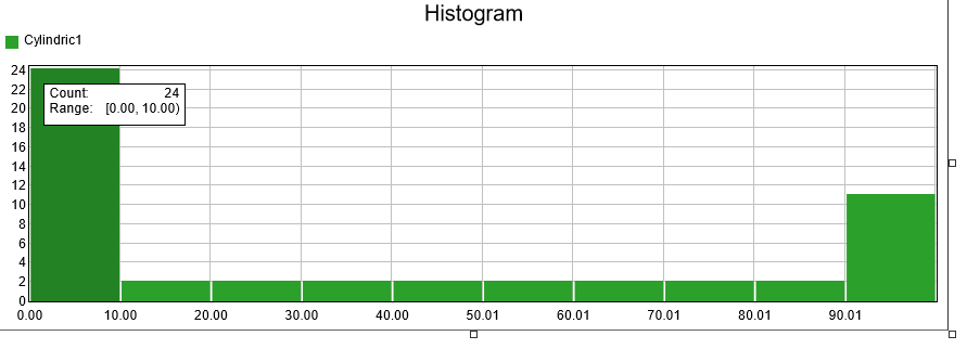
1. It listens to the OnChange instead of the OnUpdate, so if I only change the rate and not the value it does not plot anything at all. But I can install the template and manually change that.

2. It only creates data points for those times at which the value changes.

1639053865956.png
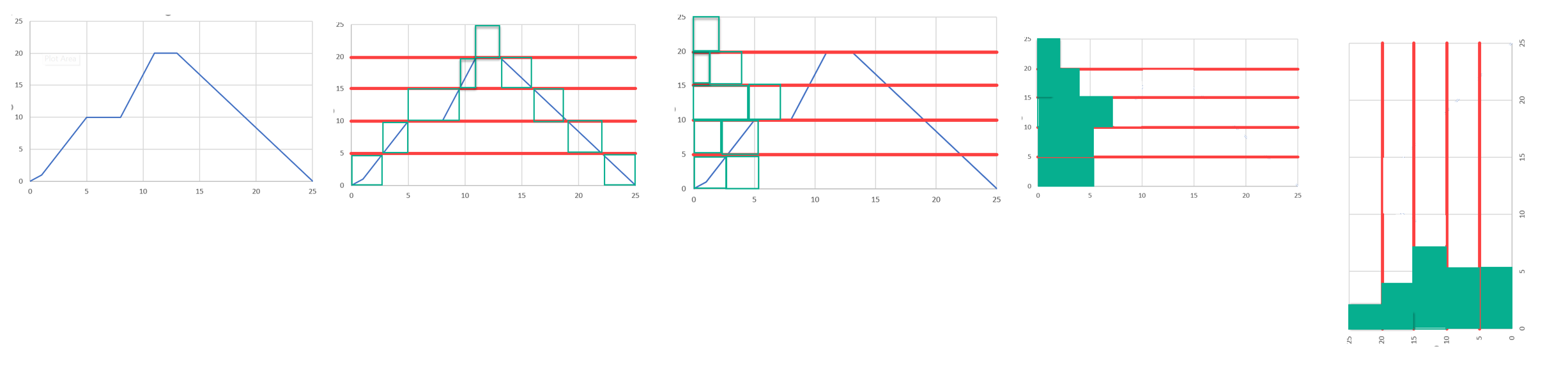
Instead, the kinetic tracked variable moves through all intermediate values as well, so I'd like to see something like this:

1639053936414.png
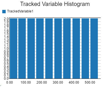
where the y-axis is not the frequency, but the total timespan of the value falling in that bucket.

A long time ago, I did this calculation 'by hand' but then you have to choose a fixed bucket size up front -- the nice thing about the histogram chart is that you feed it the raw data and can choose the bucket widths afterwards without re-running.

I understand that this is quite a big impact request that may lead to a new chart type altogether, but I still wanted to put it out here for your consideration.

chartshistogramkinetic tracked variable
1639053865956.png (9.0 KiB)
1639053936414.png (9.8 KiB)
5 |100000

Up to 12 attachments (including images) can be used with a maximum of 23.8 MiB each and 47.7 MiB total.

2 Comments

·
Jordan Johnson avatar image
1 Like"
Jordan Johnson commented Jordan Johnson edited

I think I see your vision. It's almost like a state profile, but instead of "time in a given state", it's "time in a given bucket." And I can see how that chart would be helpful, if you have a fluid tank or an AGV battery level. I guess the big difference is that, unlike a state profile, you could theoretically re-bucket the data, since the data is from a continuous axis.

Another way to think about it would be to derive it from the same data used by a line chart:

1639420251375.png

(Although the last image needs to be mirrored or something, but it gives the idea)

So yes, I can add this to the dev list. I don't know if I will get to it any time soon, so the module route is probably best for now.

5 |100000

Up to 12 attachments (including images) can be used with a maximum of 23.8 MiB each and 47.7 MiB total.

Mischa Spelt avatar image
0 Likes"
Mischa Spelt commented

Hi @Jordan Johnson I managed to get something working by making a few minor changes to the histogram.js code

1639408397896.png

But it seems that I cannot really add another Generic Chart type nor derive a module class object from it without copy/pasting in all the .cpp code from the tree.

1639408142154.pngGiven that I've written the JS, any suggestions how to get a custom chart type in the library?

Histogram.zip

· 3
5 |100000

Up to 12 attachments (including images) can be used with a maximum of 23.8 MiB each and 47.7 MiB total.

Jordan Johnson avatar image Jordan Johnson ♦♦ commented ·

That's a good question. I think the issue is that those classes aren't visible in the dll built by FlexSim. I can add that to the dev list, so you can subclass the GenericChart class.

0 Likes 0 ·
Jordan Johnson avatar image Jordan Johnson ♦♦ commented ·
Or maybe the answer is for me to add a way for module developers to add a custom chart type...
0 Likes 0 ·
Mischa Spelt avatar image Mischa Spelt Jordan Johnson ♦♦ commented ·
That is cool but sounds like a lot of work for a rare use case.

Making the classes visible in the DLL would already be a great step forward. Perhaps if you have a test build with this change, at some point, you can send it to me and I'll be happy to test it out :-)

0 Likes 0 ·

Write a Comment

Up to 12 attachments (including images) can be used with a maximum of 23.8 MiB each and 47.7 MiB total.

Your Opinion Counts

Share your great idea, or help out by voting for other people's ideas.