@Matthew Gillespie I was directed to you for this question when I called tech support. I'm using FlexSim HC and am trying to create a dashboard that shows statistics for the equipment in my model. I need to have at least a state pie and a throughput chart for each piece of equipment and groups of equipment combined. I was hoping it would work similar to my staff and location dashboards that I created using chart templates but do not see any templates for equipment. How would I go about creating the charts I need to analyze the equipment usage?
No Equipment Chart Templates in FlexSim HC?
FlexSim 21.0.4
I found a way to get a state pie for each piece of equipment by copying the internal statistics collector of the EquipmentCombinedStates people table and connecting that statistics collector to a pie chart. However, I was unable to get combined state pies for different groups of equipment, 1 pie for each group. Does anyone know how I could get these charts?
Hi @Tyler Morrison, was Jordan Johnson's answer helpful? If so, please click the red "Accept" button at the bottom of their answer. Or if you still have questions, add a comment and we'll continue the conversation.
If we haven't heard back from you within 3 business days we'll auto-accept an answer, but you can always unaccept and comment back to reopen your question.
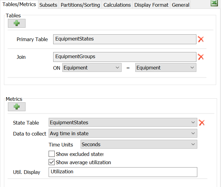
The way to get the charts you are looking for is to use the Calculated Table. First, add the state table you're interested in (probably EquipmentStates), and then add the EquipmentGroups table. The join column should automatically make it so that they are joined on those columns.
Then, add a new Metric, and choose the People States option. Make sure that it uses the same state table as you picked earlier:
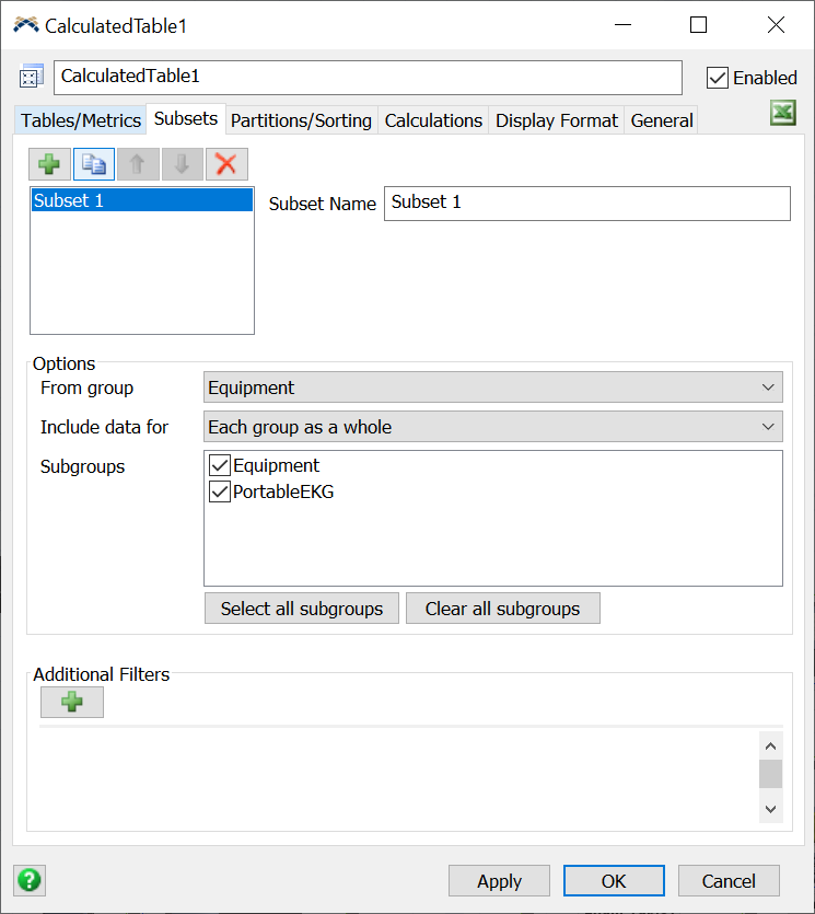
Then, to get the Group statistics you want, add a new Subset, and choose the option for People Groups. Then choose whatever groups you want, and how you want to display that data:
The next step is to set the table to update always. On the Calculations tab, change the Update Mode to Always, and you should be set. Click the Apply button, and you should see data in the table below.
The final step is to add a Bar or Pie chart, and point it at the table made by the Calculated Table. That should get you want you need.
15 People are following this question.