question

Stan Davis avatar image
0 Likes"
Stan Davis asked Stan Davis commented

Understanding States - OffShift vs Off shift / OnBreak vs On break

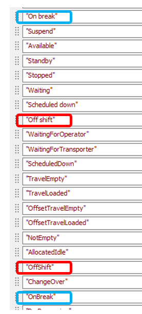
I created a custom color palette auto-filled from the default state table. That resulted in the expected 50 items that correspond to the 50 items in the default state table.

However, when running the model and observing an Operator's pie chart that uses the custom palette, the color palette expands to include these 14 additional items..

WaitingForOperator
WaitingForTransporter
ScheduledDown
TravelEmpty
TravelLoaded
OffsetTravelEmpty
NotEmpty
AllocatedIdle
OffShift
ChangeOver
OnBreak
PreProcessing
PostProcessing
End


These states already exist in the color palette but with spaces (e.g. "Off shift" vs "OffShift", "On break" vs "OnBreak"). Where are these coming from and why the difference?


Furthermore, a time table being used by the operator distinctly defines its off shift as "30 - off shift"...

1637597709967.png

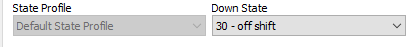
but the chart updates with "OffShift" instead of "Off shift". What am I missing in trying to understand this??

Thanks - Stan


FlexSim 21.2.4
stateschartscolor palette
1637597709967.png (2.7 KiB)
· 2
5 |100000

Up to 12 attachments (including images) can be used with a maximum of 23.8 MiB each and 47.7 MiB total.

Jordan Johnson avatar image Jordan Johnson ♦♦ commented ·
Can you post a model? It will help sort out this issue.
0 Likes 0 ·
Stan Davis avatar image Stan Davis Jordan Johnson ♦♦ commented ·

I built a small model illustrating what I am seeing.

FlexSim Help - Understanding States - OffShift vs Off shift.fsm

1637603985273.png


Thanks - Stan

0 Likes 0 ·

1 Answer

·
Jordan Johnson avatar image
0 Likes"
Jordan Johnson answered Stan Davis commented

Thanks for posting the model. Here's what's happening.

The short version: the column names in the statistics collector don't match the state names in the State Table.

The long version:

Your chart is based on a table that has one column per state. When that chart draws that table, it recognizes that it needs to choose one color per column. So the chart asks the color palette to give it a color for the column name. One of the columns is named "OnBreak", so the chart asks for a color for that value.

Unfortunately, the color palette doesn't have a color for "OnBreak", but instead, because it was filled from the state table, it has a color for "On Break". So it generates a new color, and assigns "On Break" to that color.

The solution:

The best option is to create a new chart in the dashboard. Be sure to select the pie chart from the State section of the dashboard library. This kind of chart will use the state table you made. Since you want to use the color palette you already made, be sure to uncheck the "Adjust colors based on State Table" in the chart's properties, in the Options section. Then go ahead and switch the palette in the Colors section.

Technically, you could also rename all the columns in the existing statistics collector to match the state table, which would also work, but that would be tedious.

· 1
5 |100000

Up to 12 attachments (including images) can be used with a maximum of 23.8 MiB each and 47.7 MiB total.

Stan Davis avatar image Stan Davis commented ·
Thanks for the explanation. Understood. Solution worked as described. Thanks - Stan
0 Likes 0 ·

Write an Answer

Hint: Notify or tag a user in this post by typing @username.

Up to 12 attachments (including images) can be used with a maximum of 23.8 MiB each and 47.7 MiB total.