question

martin.j avatar image
0 Likes"
martin.j asked Jordan Johnson commented

Statistics displayed as Sliding Frame

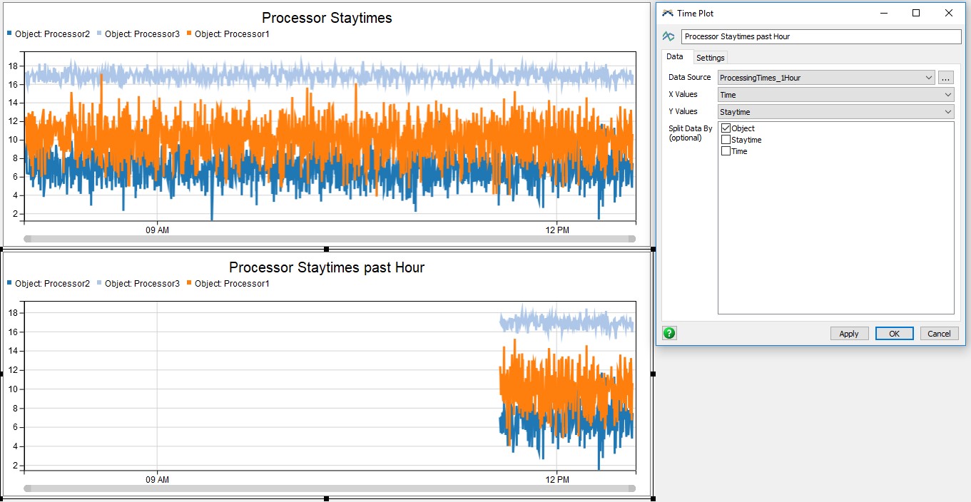
Is it possible with the new statistics collector to create a sliding frame timeplot to show data from a statistics collector for only the past hour or past day?

When running a model for an extended period of time, showing time plots and seeing any discernible trends becomes rather difficult as the number of datapoints fill the same graph. In order to analyse data and see trends as the model runs it would be better to simply see a frame of the latest data - The past hour for instance. I cant seem to find a way to set up such a thing in the graphs.

I suppose it might be possible to delete old data from the statistics collector, but that might also affect averages and data calculation.

Is there a way to display only a subset of the data in a statistics collector?

B.T.W is there a class reference for the StatisticsCollector class and its collectedData property?

statistics collectorchartsstatistical analysis
5 |100000

Up to 12 attachments (including images) can be used with a maximum of 23.8 MiB each and 47.7 MiB total.

1 Answer

·
Jordan Johnson avatar image
0 Likes"
Jordan Johnson answered Jordan Johnson commented

One way to do it would be to have a Calculated Table with a query like this:

SELECT * FROM MyStatisticsCollector
WHERE Time > (Model.dateTime - DateTime.hours(1))

This would get the last hour of the Statistics Collector (theoretically; I haven't actually tried this, and assuming you are tracking time data). If you set the Update Mode to Always, it will show what you want. However, as long as that chart is begin painted, you will be re-running the query, so that might be slow. Consider using an update interval instead.

· 2
5 |100000

Up to 12 attachments (including images) can be used with a maximum of 23.8 MiB each and 47.7 MiB total.

martin.j avatar image martin.j commented ·

I have implemented this theory in praxis, and it seems to do as you suggested, and if the update time for the table is sufficiently low it shouldn't impact performance much. The result however is not what I hoped.

The chart does not scale it view with the currently shown data, but either with the model time or more likely with the first datapoint shown, even though it is no longer available. Furthermore the legend of the chart changes with the data set so that the topmost object is first, which causes som pretty confusing color-changing behavior.

I think the solution to this has to be found in the chart and not in the data.

On a sidenote it seems like a step back that we can no longer set the legend and colors or the update frequency in the new charts. But they are of course brand new.

1 Like 1 ·
charts.jpg (179.3 KiB)
Jordan Johnson avatar image Jordan Johnson ♦♦ martin.j commented ·

I see what you mean... You can adjust the left side of the zoom bar on the bottom of the chart (be sure to leave the right side locked to the right), so that only an hour is visible. Unfortunately, that has to be done every time you run the model.

There may be a chart solution here. We have batted around several ideas about how to do it. I will count this as another vote for the "locked time window" feature (on charts with a time x-axis).

It is true that you cannot yet set the colors of the individual lines. That is a feature that will return to these charts.

1 Like 1 ·

Write an Answer

Hint: Notify or tag a user in this post by typing @username.

Up to 12 attachments (including images) can be used with a maximum of 23.8 MiB each and 47.7 MiB total.