question

Albert L avatar image
1 Like"
Albert L asked Albert L commented

State chart for groups

I currently have a line setup like the following:

Qty 5 of Machine 1, Qty 5 of Machine 2, Qty 5 of Machine 3 ... Qty 5 of Machine 50

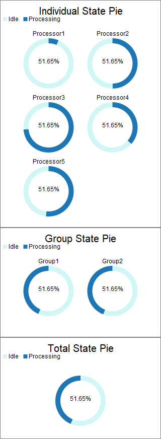
I created groups in Flexscript for each Machine type (50 groups with 5 machines each). I would like to view the state pie chart for each of these 50 groups.

I know that I can use Composite State Pie to view the average state breakdown for each group, but is there a way to create these 50 pie charts without having to do them individually? Two methods that I've tried approaching:

1. Create a supergroup that contains all 50 groups, let's call this "Big Group". When I create a Composite State Pie with "Big Group", only one chart appears which is most likely the aggregate of all 250 processors in the 50 groups. How can I get 50 pie charts to show up?

2. Use" Big Group" and regular "State Pie." What happens here is that 250 charts show up individually.

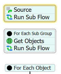
3. Add the Composite State Pies through FlexScript. I would really like to use this approach, but I have not figured out a way to add a composite state pie to a dashboard. Is there a way to do this?

FlexSim 19.0.0
groupsstate pie
5 |100000

Up to 12 attachments (including images) can be used with a maximum of 23.8 MiB each and 47.7 MiB total.

1 Answer

·
Jordan Johnson avatar image
0 Likes"
Jordan Johnson answered Albert L commented

I would recommend 3 charts:

The top chart is the individual objects. The second shows the average across each subgroup within the Big Group. The third show the total across the whole model.

statepielayers.fsm

I made this chart by first creating the State Pie template, as you did, to create the individual pie chart. Then I Installed the template. You can do that by going to the Advanced tab on the template properties window, and clicking the Install button, and then clicking Okay.

Once installed, I edited the State Pie Flow, a process flow that appears in your toolbox after you install. I replaced the top Scheduled Source with these activities:

These activities act a lot like the original scheduled source, in that one token per object is eventually created. The difference is that each of the tokens created now have a label called SubGroup, that tracks which sub group the object is in.

I also edited the State Pie Collector, to have an additional column:

This new column records the Group value found on the token.

Then, to get the per-sub-group and the overall group statistics, I created two calculated tables. The first averages the state values across each sub group. The second averages the state values across all objects in the Big Group.

Finally, I pointed two new Pie Charts (from the Charts section of the Dashboard Library) at the two new calculated tables. In order to get the colors to match, I used a Tree View to copy the variables/pieSettings/colors node from the first chart to the other two.


· 1
5 |100000

Up to 12 attachments (including images) can be used with a maximum of 23.8 MiB each and 47.7 MiB total.

Albert L avatar image Albert L commented ·

Thank you for your answer Jordan! I appreciate the comprehensiveness of the three charts and the clever approach. I didn't think of using a process flow originally, will look into the model you provided.

0 Likes 0 ·

Write an Answer

Hint: Notify or tag a user in this post by typing @username.

Up to 12 attachments (including images) can be used with a maximum of 23.8 MiB each and 47.7 MiB total.