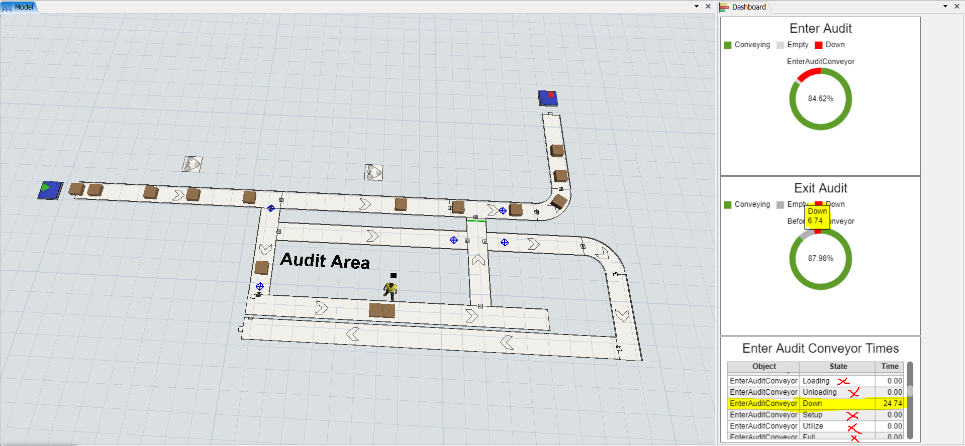
I would like to use a Dashboard Table Chart to display downtime of a conveyor. The conveyor down time in my model is caused by two separate motors stopping conveyors as flow items enter and exit the audit area. I tried to achieve this by using a state pie chart, which got me close to what I needed. With the state pie chart, I'm able to see the amount of downtime by hovering over the red portion of the pie, but I would rather have the time displayed in a table. So then, I installed the pie chart template and tried using the "Enter Audit" Statistics Collector generated from the pie chart to create a table chart using the data from that statistics collector. This got me what I needed, but now I have all these extra states that I don't want to see in the table.
So how do I get rid of all of the unwanted states? I only want my table chart to display the same states as the pie chart - empty, conveying, and down.

Additionally, is it possible to sum up the total down time of multiple conveyors into one table? For example, is there a way to use one table to sum the down time of the conveyor entering the audit area plus the down time of the conveyor that shuts down as items exit the audit area.
