Hi,
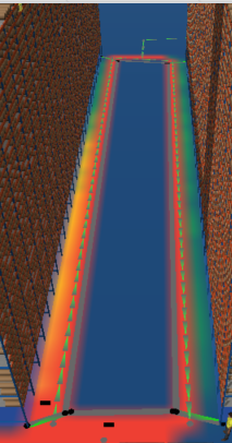
I am trying to understand if there is a way to quantify the colors of the heat map and compare them: like Red = x% of total traversals, Green = y% of total traversal,
The units "% of total traversals" are just an example, they could be changed to something more appropriate as long as the quantitative data remains consistent for comparison.
I looked at Matthew's answer here How are the A* heat map colors calculated? - FlexSim Community but based on the calculation couldn't quite figure how to achieve what I am looking for.
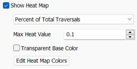
My max heat value is 0.1 and the map is set to Percent of Total Traversals, in my heat map I understand that the Reds are most travelled, and Green/Blues are least travelled.

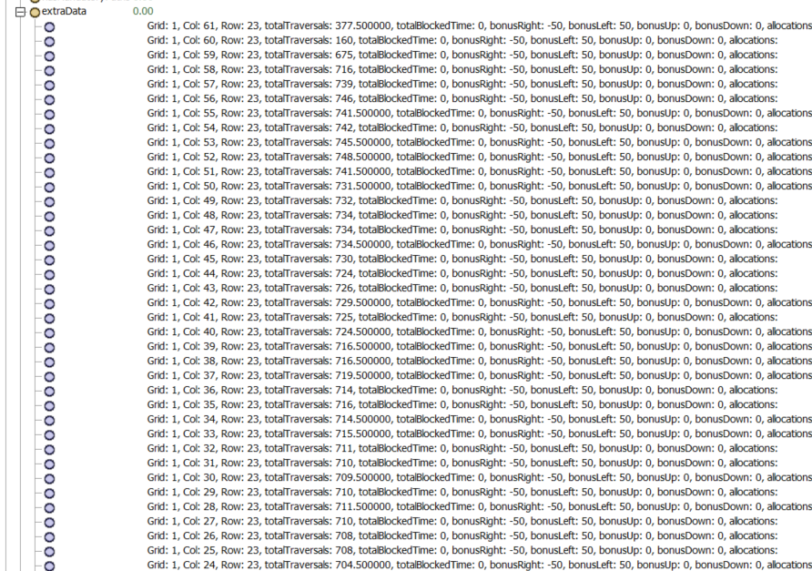
 I also found Joshua's answer here Heat map gradient - FlexSim Community however, I don't think that answers the question of how to translate the colors into numbers.. I see the AStar grid node data but not sure which node translates to what point on the heat map.

Let me know if something is unclear, thank you for your time!
