question

Patryk avatar image
0 Likes"
Patryk asked Jason Lightfoot commented

Custom GUI chart

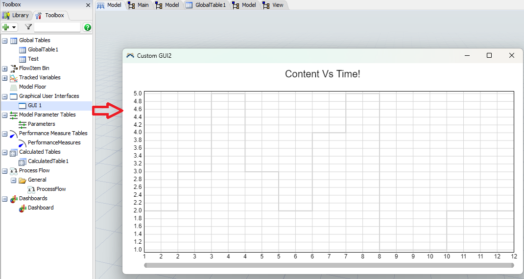
I would like to create a "Content VS Time" chart that is displayed in a custom GUI.

I managed to create a chart, but I don't know how to change the color and edit the legend to show the queue name "Q".

I create data for the chart using a calculated table.

Model: wykresy_4.fsm

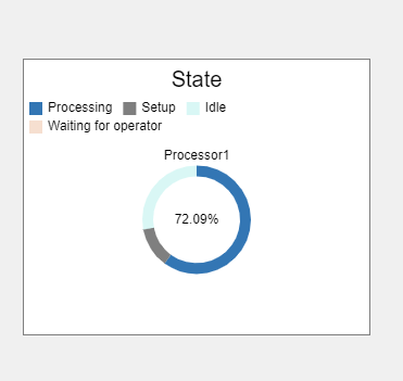
And how to create a pie or line chart showing machine states in the custom GUI?

Obraz zawierający tekst, zrzut ekranu, Czcionka, designOpis wygenerowany automatycznie

he data for the graph for the queue was read from the global "Test" table.

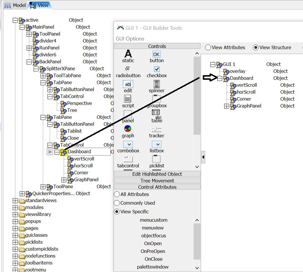
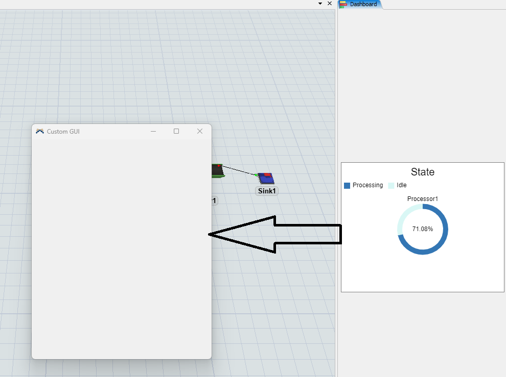
I would like to display the same charts as are currently available in the dashboard, but in the Custom GUI

Currently the chart in the custom gui is gray and I would also like to change it to a different color

FlexSim 23.2.2
codechartscustom gui
1703155930563.png (10.1 KiB)
wykresy-4.fsm (47.5 KiB)
5 |100000

Up to 12 attachments (including images) can be used with a maximum of 23.8 MiB each and 47.7 MiB total.

Joerg Vogel avatar image
1 Like"
Joerg Vogel answered Joerg Vogel commented

I cut a the Dashboard Node from View tree.

I added a new node below GUI1 by hitting return.

I pasted the cut dashboard node into this new node.

The chart moves from View into GUI view. It is then completly inactive from Workspace control then, once you activated the GUI view window. If you load such a model, the Dashboard view is only activateable until you open the GUI.Move_dashboard_to_GUI.fsm (FlexSim Version 24)

Edit:

Move_dashboard_to_GUI_jv.fsm(FlexSim Version 23.2)

dashboard-to-gui.jpg


· 1
5 |100000

Up to 12 attachments (including images) can be used with a maximum of 23.8 MiB each and 47.7 MiB total.

Mauricio Aranda avatar image
0 Likes"
Mauricio Aranda answered Jason Lightfoot commented

Currently i see that the chart is linked to a processor, if you want to change the legend from "Processor 1" to "Q", you can simply change the name of the processor to "Q" and it should change the chart legend. You can also change the name of the chart to anything you want by clicking the chart and changing its current name whis is "State".

To change the colors and the state names you would have to create a new pallete of colors and change it from the "Internal Pallet" to the one you make.


Hope this helps!

· 6
5 |100000

Up to 12 attachments (including images) can be used with a maximum of 23.8 MiB each and 47.7 MiB total.