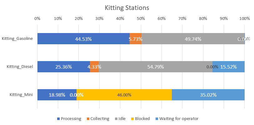
I want to make each state % utilization visible in bar chart dashboard like below.
is there any option we can see chart like this in flexsim?
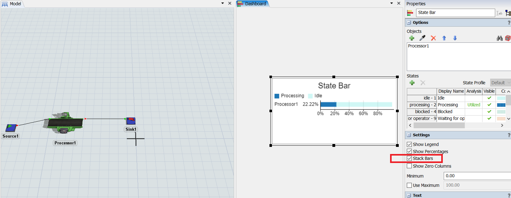
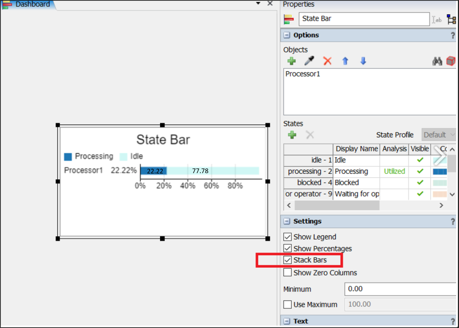
Flexsim currently gives total utilization on Y Axis, instead I want to see each state % utilization like below.


