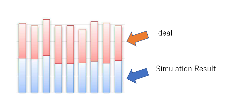
To compare simulation result to ideal number, is it possible to display both in one chart like below? ideal number will come from (ex.) globaltable, but simulation result will come from statistic collector.
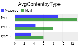
Hi @Ryosuke S, here's an example where I have the ideal along with the measured on the same chart. They aren't stacked, but still give some idea of how close you are to the ideal. I added a column to a stats collector called 'ideal' that references a global table called 'IdealAvgcontent.' Then I used the chart's data format to be 'One bar group per row' and checked the boxes to include both the measured and ideal columns.
15 People are following this question.
FlexSim can help you understand and improve any system or process. Transform your existing data into accurate predictions.
FlexSim is a fully 3D simulation software environment. FlexSim can be used to simulate any process in any industry.
FlexSim®, FlexSim Healthcare™, Problem Solved.®, the FlexSim logo, the FlexSim X-mark, and the FlexSim Healthcare logo with stylized Caduceus mark are trademarks of FlexSim Software Products, Inc. All rights reserved.
May we collect and use your data?
Learn more about the Third Party Services we use and our Privacy Statement.May we collect and use your data to tailor your experience?
Explore the benefits of a customized experience by managing your privacy settings for this site or visit our Privacy Statement to learn more about your options.