question

Mark S2 avatar image
0 Likes"
Mark S2 asked Mark S2 commented

Time Plot Data Points Instead of Continuous Line

Hello Flexfam,

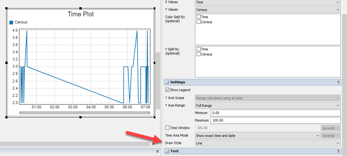
I created a statistics collector to query and combine the content of two wait lines, however the dashboard 'Time Plot' I added is only displaying data points rather than a continuous line. I modelled the statistics collector off of the same one that creates the "Waitling Line - Census Line Chart" dashboard, so I was expecting it to be the same but alas it is not.

Any help would be appreciated...my knowledge of stats collectors is not great so I am probably missing something pretty basic.

Thanks,

Mark

hi-entrance-model- V13.fsm

FlexSim 21.0.3
statistics collectorwaiting linetime plotdasbhoard
5 |100000

Up to 12 attachments (including images) can be used with a maximum of 23.8 MiB each and 47.7 MiB total.

1 Answer

·
James Rodgers1 avatar image
1 Like"
James Rodgers1 answered Mark S2 commented

Assuming you are referring to the plot in the picture below, look for the "Draw Style" setting:draw-style.jpg


draw-style.jpg (99.8 KiB)
· 1
5 |100000

Up to 12 attachments (including images) can be used with a maximum of 23.8 MiB each and 47.7 MiB total.

Mark S2 avatar image Mark S2 commented ·
Thanks Jim!
0 Likes 0 ·

Write an Answer

Hint: Notify or tag a user in this post by typing @username.

Up to 12 attachments (including images) can be used with a maximum of 23.8 MiB each and 47.7 MiB total.