question

Gui Vaccaro avatar image
0 Likes"
Gui Vaccaro asked Gui Vaccaro commented

Bug on sink output mapping, statistics collector

Hello,

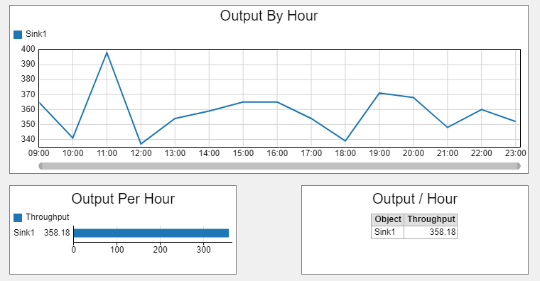
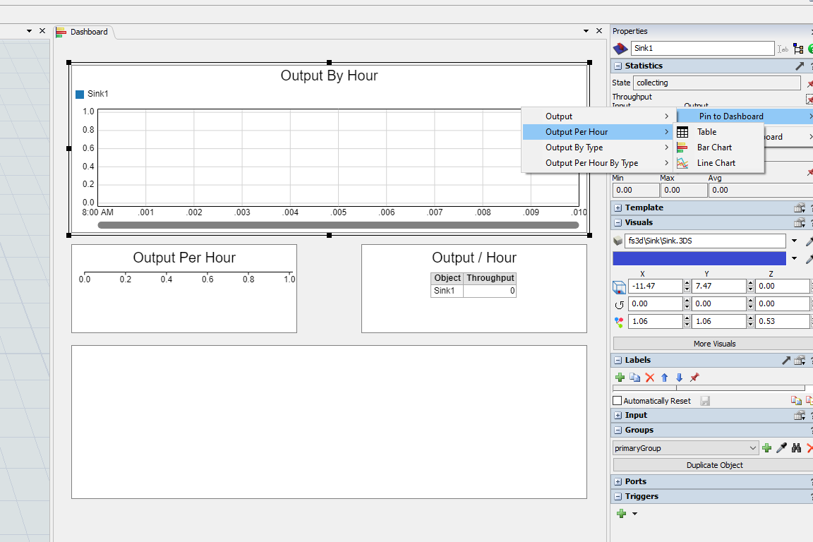
The sink object has a conceptual problem regarding statistics. Either a sink has input but does not have output (what seems the way it is modeled in FlexSim), or its output is mapped to point to the input (as the output of a sink is the number of destroyed elements in a model, hence, equal to its input). As this concept is not clear, when one uses the "Throughput > Output By Hour" pin to model throughput on a sink, the result is a useless chart (as it maps the output of the sink, not its input).

In the picture below I am using a statistics collector on the left side and the sink pin on the right side. They should present similar profiles; the chart on the right is empty.

1737841852248.png

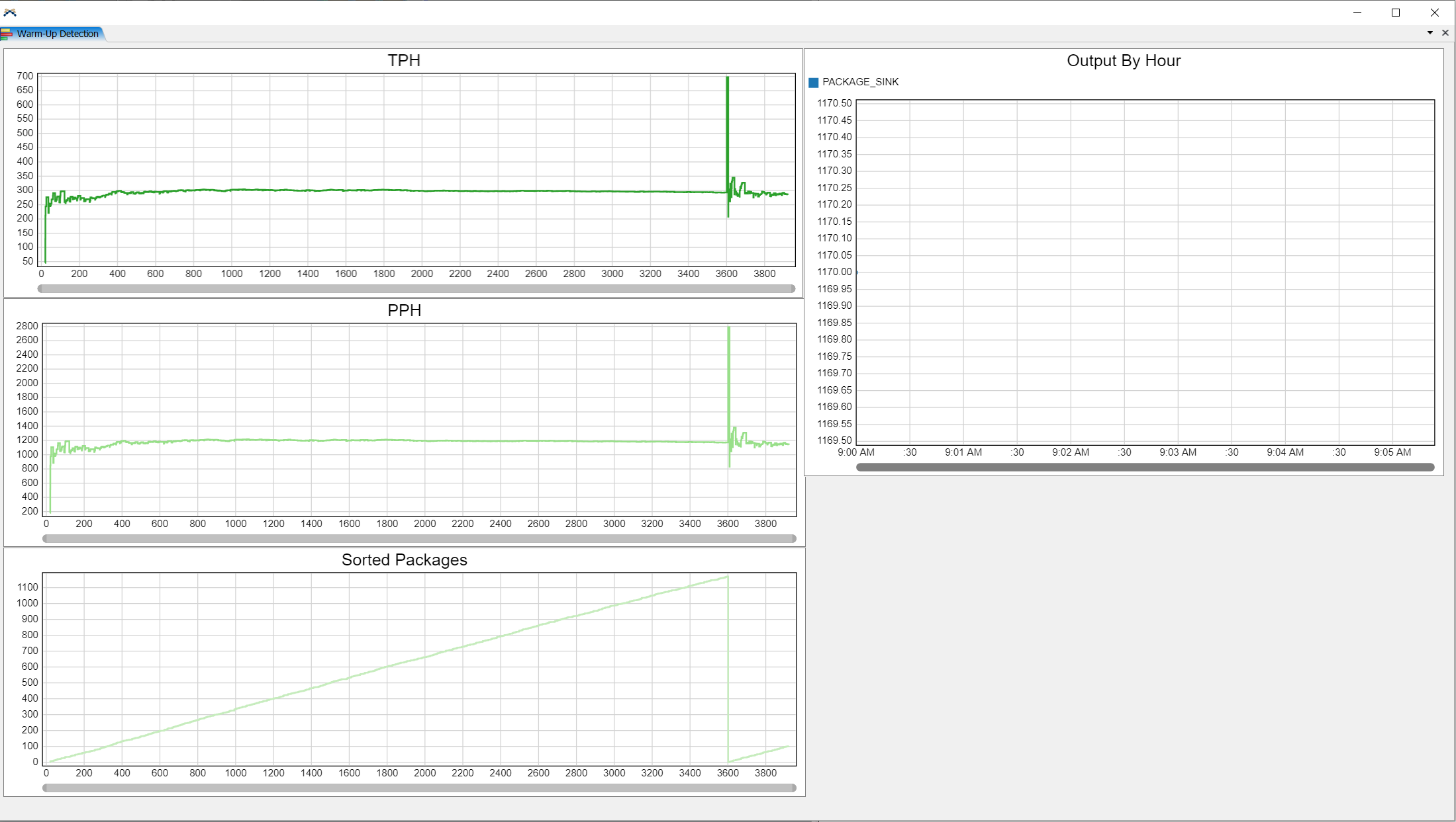
Another point is related to the statistics collector. As the "output by hour" does not allow one to re-scale the values (e.g. output by hour / number of operators in a system), a statistics collector needs to be used. When there is a warm-up, to make the statistics consistent, one has to use something like

  1. current.as(Object).stats.input.value * hours(1) / Model.statisticalTime

where current is the sink object. However, as "statistical time" is set to zero when the warmup ends, there is a "pulse effect" that mistakenly skews the chart produced with the statistics collector. This creates problems regarding trust on results for non-statistical-savvy audiences (i.e., there is no way to show the charts on the left side to them, to justify the warm-up period selection).

Thank you for any clarification and report of corrections.

FlexSim 25.0.2
statistics collectorbug reportoutputpin to dashboardthroughput template
1737841852248.png (223.2 KiB)
5 |100000

Up to 12 attachments (including images) can be used with a maximum of 23.8 MiB each and 47.7 MiB total.

1 Answer

Felix Möhlmann avatar image
0 Likes"
Felix Möhlmann answered Gui Vaccaro commented

The dashboard library makes a distinction between an "Output/Hour" chart, which is the value you calculate in your Statistics Collector, but only shown as a single value in either a bar or table chart, and an "Output By Hour" chart, which plots the output over the last hour.

capture.png

When pinning the output stat to a dashboard this distinction is not made. But if you choose the line chart option FlexSim will actually create an "Output By Hour" chart. So the chart on the right side of your screenshot is not useless (you can actually see the first data point at 1170 at 9 AM). It's just not the type of chart you rightfully assumed it would be based on the naming convention.

I get that the purpose of the chart is to show that the model has reached a sufficiently "stable" state after one hour and thus this point is chosen as the warmup time. Though I'm not sure how you expect the "pulse effect" to be solved.

I guess either by using an "Output By Hour" chart which doesn't care about the warmup time anyway or by having the collector store the input stat at the warmup time so it can essentially be ignored.

stats-collector-ignore-warmup.fsm


· 1
5 |100000

Up to 12 attachments (including images) can be used with a maximum of 23.8 MiB each and 47.7 MiB total.