I would like to make a dashboard chart that shows utilization per hour of a resource group, but I can't find that in the chart options.
This option is only available on a Box Plot chart. Once you've changed your chart to be a box plot you get the option to specify the Periods per Day.
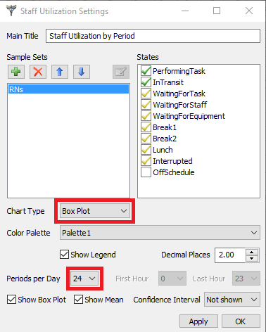
Attached is a model with a working Utilization by Hour chart for the resource group.
5 People are following this question.
FlexSim can help you understand and improve any system or process. Transform your existing data into accurate predictions.
FlexSim is a fully 3D simulation software environment. FlexSim can be used to simulate any process in any industry.
FlexSim®, FlexSim Healthcare™, Problem Solved.®, the FlexSim logo, the FlexSim X-mark, and the FlexSim Healthcare logo with stylized Caduceus mark are trademarks of FlexSim Software Products, Inc. All rights reserved.
Privacy | Do not sell or share my personal information | Cookie preferences | Report noncompliance | Terms of use | Legal | © Autodesk Inc. All rights reserved