question

John Liow avatar image
1 Like"
John Liow asked John Liow answered

Average Waiting Time Per Patient

Hi FlexSim Community,

We are currently working on a hospital sim that involves waiting time of patients.

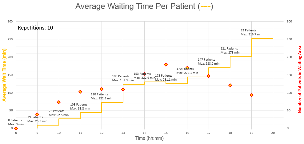
Basically we wanted to plot the Average Waiting Time for all patients who are present at a waiting area for 1 hour time intervals between 8 am in the morning till 8 pm at night, though we are not sure if the FlexSim Dashboard provides this feature such that the above graph can be generated. Can anyone advise on this?

Description of Graph (above)

1. Patients arrives randomly at waiting area for consultation (a process) that follows. We exported the .csv file for the census history such that the entry (+1) and exit times (-1) for each Patient ID can be used to calculate the total time spent by each patient in each time interval (e.g. 1100-1200, 1200-1300, 1300-1400, ...)

2. Using the individual info in 1, we next sum up the cumulative time spent by the patient up till the end of every time interval. As an example, for Patient ID 22, he enters the waiting area at 9.15am and exits at 11.30am (total of 2h 15 min), he will therefore have cumulatively stayed 45 min for Time Interval 9-10, 45+60 min for Time Interval 10-11, and 45+60+30 min for Time Interval 11-12.

3. For each time interval, Repeat 2 for all patients, then take the average. This gives the Average Wait Time that allows us to plot a step graph (in Orange). The info at each time interval also facilitates the labeling of information such as:

a.) Number of patients waiting in a certain time interval (shown as a secondary axis plot with Red Markers)

b.) Maximum time waited (by the patient among everyone in 3a who spend the most time up to that point in the waiting area)

***Graph above was generated in Excel, but we are hoping to achieve the same in FlexSim

@Matthew Gilles

Choose One
waiting times
7153-ghniy.png (28.3 KiB)
5 |100000

Up to 12 attachments (including images) can be used with a maximum of 23.8 MiB each and 47.7 MiB total.

Cliff King avatar image
0 Likes"
Cliff King answered

What a beautiful graph! I'm assuming you built this from the raw census data FlexSim pumps out. If so, you did a skilfull job of converting it into such a nice graph, because that particular raw data file is difficult to work with.

Unfortunately, I know of no way to duplicate the exact graph you made in FlexSim. It's impossible to present two types of metrics on the same graph (such as a you've done with the step graph in orange and the red diamond marks) in a FlexSim dashboard widget. The closest you can get to what you have in FlexSim would be to create a Dwell Time widget of your waiting room location, select Box Plot for your Display Type, and then specify that you want 24 hourly periods displayed per day. This will give you a box plot displayed for each hour of the day, and box plots are nice because you can get lots of nice statistics for the hour, such as mean, median, 25th and 75 percentile, and even a confidence interval. It's not quite as beautiful as your graph however.

I have a question about your red marks displaying number of patients. Is this an average of the patient count at the top of each hour, or is it somehow averaging the number of patients that were in the waiting room across the period (an average of an average)?

5 |100000

Up to 12 attachments (including images) can be used with a maximum of 23.8 MiB each and 47.7 MiB total.

John Liow avatar image
0 Likes"
John Liow answered

Hi Cliff, we've switched to the box plot for its elegant statistics features in our presentation. =)

Thanks again for pointing that out to us, on a side-note we are incidentally drawn to the Data Collector Widget too while talking about the many merits of FlexSim yesterday.

Looking forward to more sharing in next couple of months in the FlexSim forum too!

5 |100000

Up to 12 attachments (including images) can be used with a maximum of 23.8 MiB each and 47.7 MiB total.

Cliff King avatar image
0 Likes"
Cliff King answered

Thanks for sharing your work with the community John! If your calculations for converting the census raw data table are all contained within the Excel workbook that generated that beautiful chart of yours, would you mind sharing that as well?

5 |100000

Up to 12 attachments (including images) can be used with a maximum of 23.8 MiB each and 47.7 MiB total.

John Liow avatar image
0 Likes"
John Liow answered

Thanks Cliff. The red diamond markers represents the number of patients in the waiting area at the end of the time interval (i.e. from 1400 to 1500hh on the graph,the red diamond refers to the 153 patients who are still in the waiting area at the last second, say 14:59:59 hh)

As a follow-up to your suggestion, I created a simple example of it for everyone's benefit.

210617sink-dwell-time-box-plot.fsm


5 |100000

Up to 12 attachments (including images) can be used with a maximum of 23.8 MiB each and 47.7 MiB total.

Write an Answer

Hint: Notify or tag a user in this post by typing @username.

Up to 12 attachments (including images) can be used with a maximum of 23.8 MiB each and 47.7 MiB total.