I am trying to understand how many patients can be seen per week for a certain service in my model. Is there a way to create a chart for the dashboard that shows the weekly volume throughput of a service?
Since there are no objects that measure throughput of patients in the HC environment I'm going to give you an option that uses the statistics collectors that are the data source for all the Healthcare chart templates in the library.
You are going to start with a "Model Throughput" chart under the "People" section of the dashbboard library panel. Then, add a Partition under the chart properties that uses a "Custom expression". Notice in that menu there are a couple of time based ways of breaking out the data, like hour of the day and day of the week that are fairly common. Unfortunately there isn't a built in option to break out data by weeks so I'll show you how to do that.
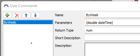
Click on the Toolbox tab, click the ![]() button and find the "User Command" option under the "Modeling Logic" section. Name the command ByWeek in the "Name" field then define the command's parameters in the Parameter field to say (double dateTime). include the parentheses.
button and find the "User Command" option under the "Modeling Logic" section. Name the command ByWeek in the "Name" field then define the command's parameters in the Parameter field to say (double dateTime). include the parentheses.
It should look like this:
Now Click on the ![]() button on the "Code" field and copy this code into the window:
button on the "Code" field and copy this code into the window:
/**Custom Code*/
DateTime dt = DateTime(param(1));

DateTime duration = dt - Model.startDateTime;
return Math.floor(duration.totalDays / 7) + 1;
And click OK on that window and close the user command window.
Now we are going to go back to your chart template and in the expression field for your partition type:
ByWeek(Time)
This will look at the Time column that the statistics collector has and figure what week it is in your model and patients that leave in that week will be counted towards that week’s throughput.
Depending on the chart style you chose it wil either add a bar for each new week or a row in the table display.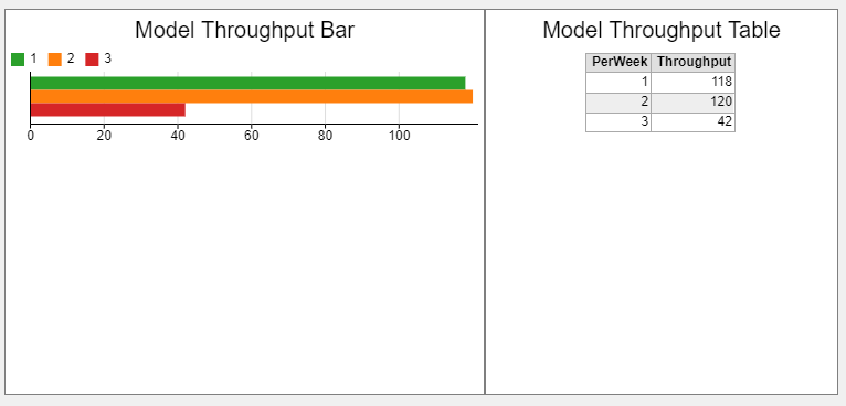
Hi Nathan, for a Healthcare model you can select the object in the model you want to see the output for and select Statistics in the properties on the right. From there, click the Pin option for Throughput and from the Pin to Dashboard dropdown select Output per Hour and create whichever table works best for your model. You can then go to the properties for that table and change the interval to weekly. Keep in mind that these are instructions for getting output from a 3D object in your model, let us know if you need instructions for how to do this for Process Flow activities.
Hello thanks for your input. Unfortunately, I do what you said and I don't get the option to have a chart for output per hour. I only have output vs time which seems to be the sum over time and can't change it to be weekly. What is the process flow way of getting that statistic? Could I use that way as a workaround? Thanks for your help!
Hi @Nathan H5,
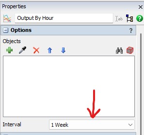
One way that you show weekly throughput is by using a output by hour chart in the dashboard, and then changing the interval of collection from 1 hour to one week. The attached pictures show how this works.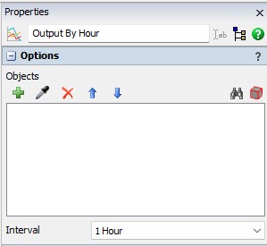
19 People are following this question.