question

Pert P avatar image
0 Likes"
Pert P asked Jeanette F commented

Dashboard Healthcare

I have some model about healthcare I want to track. that How many patient incoming into system, Show graph line plot (X-axis time, Y-Axis Number of patients) track waiting time and How many patients out of system? I don't know how to make a dashboard.


demo-hc-1.fsm

FlexSim 22.2.4
dashboardshealthcare
demo-hc-1.fsm (122.8 KiB)
· 1
5 |100000

Up to 12 attachments (including images) can be used with a maximum of 23.8 MiB each and 47.7 MiB total.

Jeanette F avatar image Jeanette F ♦♦ commented ·

Hi @Pert P, was Felix Möhlmann's answer helpful? If so, please click the "Accept" button at the bottom of their answer. Or if you still have questions, add a comment and we'll continue the conversation.

If we haven't heard back from you within 3 business days we'll auto-accept an answer, but you can always unaccept and comment back to reopen your question.

0 Likes 0 ·

1 Answer

·
Felix Möhlmann avatar image
1 Like"
Felix Möhlmann answered Felix Möhlmann commented

You can add a new dashboard to the model in the toolbox or the menu bar at the top.

1680090528031.png

When you click into the dashboard window, the library changes to display pre-defined chart types which cover a lot of use cases. The things you describe would be covered by a Census vs. Time chart (click on census and then on line chart), an Avg Staytime or Avg Wait Time for Location chart (depending on what exactly you want to measure, time spend in a waiting room and time spend waiting for a treatment room might be same value) and a Model Throughput Chart.

1680090769994.png

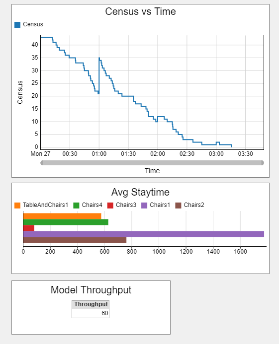
In the screenshot (from the attached model), I configured the Avg Staytime chart to partition the data by location. By default the chart would show the average staytime across all locations and patients. You can also partition by different values, for example to get the staytime for each patient.

1680090941589.png

demo-hc-fm.fsm


1680090528031.png (3.4 KiB)
1680090769994.png (36.4 KiB)
1680090941589.png (4.7 KiB)
demo-hc-fm.fsm (129.0 KiB)
· 2
5 |100000

Up to 12 attachments (including images) can be used with a maximum of 23.8 MiB each and 47.7 MiB total.

Pert P avatar image Pert P commented ·

I'm not sure, I understand true or not. On the graph Census vs Time that show to people in system. Assume simulate 00:00:00-23:00:00 patient will come into system the most at 08:00-12:00 and then decreasing after that and graph not show behavior like that, and x-axis time not show completely (00:00-23:00)

0 Likes 0 ·
Felix Möhlmann avatar image Felix Möhlmann Pert P commented ·

The people census chart shows the total number of patients of the system, which does reflect the settings in the source: Large increasing in the morning up to around noon, then trailing off.

If you want to only see the input, you could have each patient first move to a fixed location and show the census for just that location.

demo-hc-fm(1).fsm

0 Likes 0 ·
demo-hc-fm1.fsm (133.0 KiB)

Write an Answer

Hint: Notify or tag a user in this post by typing @username.

Up to 12 attachments (including images) can be used with a maximum of 23.8 MiB each and 47.7 MiB total.