Hello everyone!
I need to see the percentages in the following calculated table in a time plot, so I can see their behaviour over time.
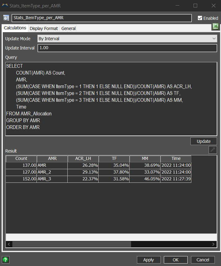
How can I achieve this result?
Thank you in advance for your help.
Hello everyone!
I need to see the percentages in the following calculated table in a time plot, so I can see their behaviour over time.
How can I achieve this result?
Thank you in advance for your help.
Each of the charts requires the table to be in a specific format so it can be visualized. For the time plot, that format is described here:
https://docs.flexsim.com/en/23.1/Reference/Dashboard/Charts/TimePlot/TimePlot.html
At first glance, it looks like you have a "wide" table, where each row has a time value and one data value per column. In contrast, the timeplot in FlexSim requires a "tall" table, where there is a column for the time values, a column for the y values, and a column for the "category" value, such as the name of a statistic.
Current data layout:
| Time | Stat1 | Stat2 | Stat3 |
|---|---|---|---|
| Time1 | Value1 | Value2 | Value3 |
| Time2 | Value4 | Value5 | Value6 |
Data layout for the time plot:
| Time | Stat | Value |
|---|---|---|
| Time1 | Stat1 | Value1 |
| Time1 | Stat2 | Value2 |
| Time1 | Stat3 | Value3 |
| Time2 | Stat1 | Value4 |
| Time2 | Stat2 | Value5 |
| Time2 | Stat3 | Value6 |
To create a table in the second format, you have a couple options in general. I don't know if they will work as written here without a model, but they are starting points:
Hopefully that gives you some guidance.
13 People are following this question.
FlexSim can help you understand and improve any system or process. Transform your existing data into accurate predictions.
FlexSim is a fully 3D simulation software environment. FlexSim can be used to simulate any process in any industry.
FlexSim®, FlexSim Healthcare™, Problem Solved.®, the FlexSim logo, the FlexSim X-mark, and the FlexSim Healthcare logo with stylized Caduceus mark are trademarks of FlexSim Software Products, Inc. All rights reserved.
May we collect and use your data?
Learn more about the Third Party Services we use and our Privacy Statement.May we collect and use your data to tailor your experience?
Explore the benefits of a customized experience by managing your privacy settings for this site or visit our Privacy Statement to learn more about your options.