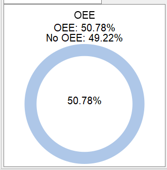
Hello everyone, I have a problem when plotting two sectors in a pie chart.
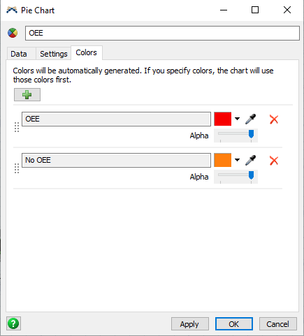
I would like the "OEE" and "No OEE" factors to be plotted together in a single pie chart, one of one color and the other of another color
The information comes from a statistic collector that I made.
How could I do that?
I hope you can help me
next I shared the model I made and an image of how the pie chart comes out.


