This article demonstrates how to use the Statistics Collector and Calculated Tables to create three utilization pie charts:
- a state pie chart
- an individual utilization pie chart
- a group utilization pie chart
Example Model
You can download that model (utilizationdemo.fsm) to see the working demonstration. The model has a Source, a Processor, a Sink, a Dispatcher, and several operators. The operators carry flow items to and from the processor, as well as operate the processor.

The operators are in a group called Operators.
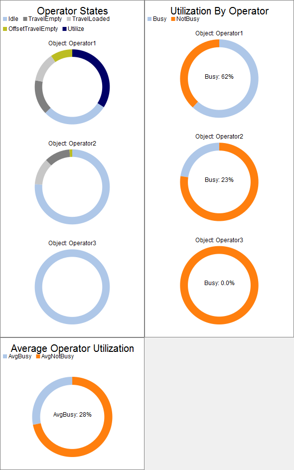
State Pie Chart
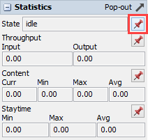
First, we need to make a Statistics Collector that collects state data for the operators. The easiest way to do that is to use the pin button to pin the State statistic for any object in the model. Use the pin button to pin a pie chart to a new dashboard.
The pin button creates a new Statistics Collector, as well as a new chart. Open the properties for new Statistics Collector (double click on it in the toolbox), and change its name to OperatorStatePie. On the Data Recording tab, remove the object from the Enumerated Rows table. Using the sampler, add the Operators group (you can sample it in the toolbox).
Now, when you reset and run the model, the state chart should work.
Utilization Pie Chart
Often, users need to combine sever states into a single value that can be used to determine the utilization of an object in the model. In order to gather this data, we can use a calculated table. Make a new Calculated Table, and give it the following query:
- SELECT Object,
- (TravelEmpty + TravelLoaded + Utilize) / Model.statisticalTime AS Busy,
- 1 - Busy AS NotBusy
- FROM OperatorStatePie
This query sums the time in several states into a total, and then divides by the statistical time. Be sure to set the name of the table (the part after FROM) to the name of your Statistics Collector. Run the model for a little bit of time, and then click the Update button on the properties window. You should get a table like the following:
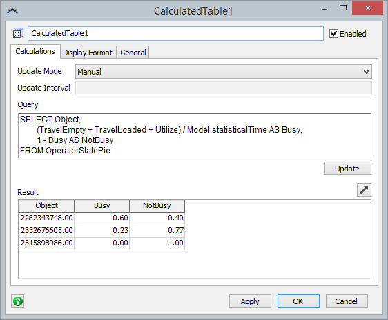
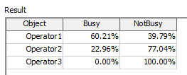
Instead of viewing the data as just numbers, change the Display Format of each column to better represent the data. On the Display Format tab, set the Object column to display Object data. Then set the other two columns to display percentages. When you switch back to the Calculations tab, the data will be formatted:
Once we get the query right, set the update mode to Always. This will updated the data in the table whenever the data is needed, including every time the chart draws. If updating the table is computationally expensive, you can use the By Interval or Manual options. Generally, a small number of rows (1-100) is small enough to use the Always mode.
Regardless of the update mode, we can make a chart based on this table. In the dashboard, create a new Pie Chart. For the Data Source, select the calculated table. For the Pie Title, select the Object column. For the Center Data, select the Busy column. Be sure to include the Busy and NotBusy columns.
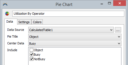
This should show you a pie chart, comparing the operator's busy and not busy time.
Group Utilization
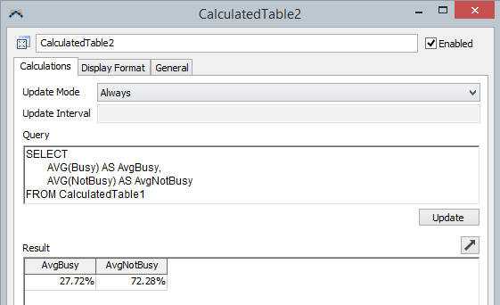
To make the final utilization chart, make a second calculated table. The query for the second table should be as follows:
- SELECT
- AVG(Busy) AS AvgBusy,
- AVG(NotBusy) AS AvgNotBusy
- FROM CalculatedTable1
Again, use the Update button to be sure the query is correct. Once it is, set the update mode to Always.
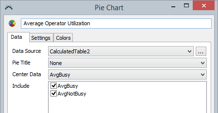
Finally, you can make the pie chart for this data:
Things to Try
If you feel comfortable with this model, you can try a couple extra tasks, such as:
- Remove one of the operators from the group, reset, and run. The charts will update accordingly.
- Add the Processor to the group, reset, and run. The state chart should work automatically.
