question

Patrick Cloutier avatar image
1 Like"
Patrick Cloutier asked Patrick Cloutier commented

How to graph utilization vs time in dashboard?

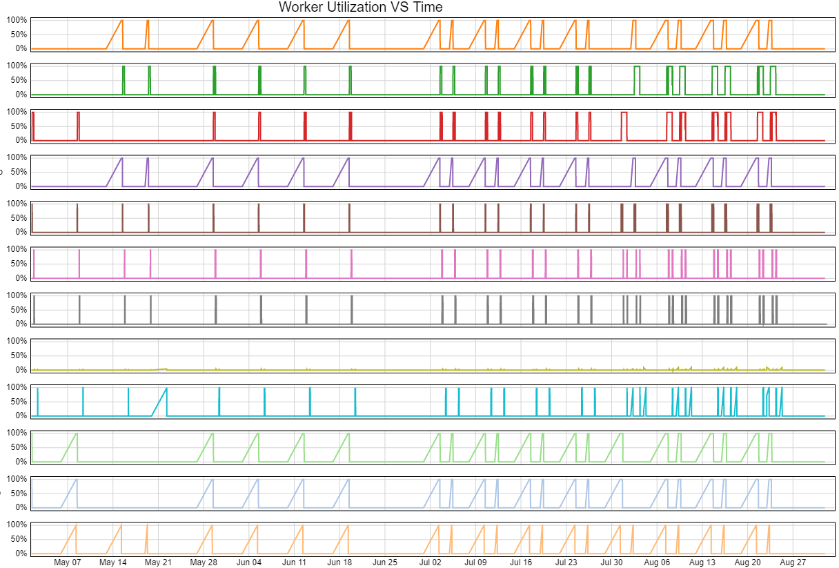
Hello, I need to chart the utilization vs time of workers and processors on a dashboard. I was hoping for a simple State chart template like there is for other stats but there is none.

I have seen posts with hints of solutions but none propose a simple standard way of doing it were you can easily choose which objects you want like in a regular chart template.

It is a fairly standard requirement as the average utilization doesn't mean as much as the fluctuations over time.

I tried to do it in this sample model but it doesn't work yet.

1 - How can I reference the group of workers instead of just the worker?

2 - What else do I need to change to make it work?

I really think should be a standard chart template.

Thanks a lot,

UtilizationVStime.fsm

FlexSim 21.2.4
chart templates
utilizationvstime.fsm (607.4 KiB)
5 |100000

Up to 12 attachments (including images) can be used with a maximum of 23.8 MiB each and 47.7 MiB total.

1 Answer

·
Jordan Johnson avatar image
0 Likes"
Jordan Johnson answered Patrick Cloutier commented

Is this what you are looking for?

1636400384017.png

If so, here are the steps to create it:

  1. Make a state table (you had already done that)
  2. Make a Process Flow. The purpose of the process flow is to create one token per worker (in the group) per time interval. Each token will have a TrackedVariable. You'll listen to the state of each object, and when it changes, set your tracked variable to the same value.
  3. Get the utilization for the TrackedVariable from the state table.
  4. At the end of the time interval, log the time, worker, and utilization in the stats collector
  5. Make a chart

Here's the model, so you can investigate these steps:

utilizationvstime_1.fsm

Adding a removing objects from the group will add or remove them in the chart. The ProcessFlow Variable called Interval determines how often the utilization is recorded.

This reason for all these steps is that you have to "forget" about the time spent in any state in previous time intervals.

If you confirm that this chart is what you want, I can add a request to the dev list.


· 8
5 |100000

Up to 12 attachments (including images) can be used with a maximum of 23.8 MiB each and 47.7 MiB total.

Patrick Cloutier avatar image Patrick Cloutier commented ·

Hello Jordan, this works awesomely great for operators and I'm using it right now in a case where I have 2 cranes and I measure their hourly utilization. It works great but I don't understand how it works.

And I'm trying to also plot the total utilization of both cranes. How could I tweak to process flow or the stats collector to also show the total utilization of both cranes?

On the same graph I'd have: crane1, crane2, total of both. Or it could be 2 different graphs if its easier.

I could export the current graph data to csv, make a pivot table and chart it in Excel but I was wondering if it can easily be done directly in FlexSim.

Thanks a lot,

1 Like 1 ·
Jordan Johnson avatar image Jordan Johnson ♦♦ Patrick Cloutier commented ·
I will write an answer for your questions, but please post this comment as a new question, and include a link back to this question.
0 Likes 0 ·
Patrick Cloutier avatar image Patrick Cloutier Jordan Johnson ♦♦ commented ·

Done, but I didn't know how to insert this into the question: @Jordan Johnson

0 Likes 0 ·
Patrick Cloutier avatar image Patrick Cloutier commented ·
Jordan, the link to the model gives me a HTTP Status 404 - Not found error
0 Likes 0 ·
Jordan Johnson avatar image Jordan Johnson ♦♦ Patrick Cloutier commented ·
I reposted it, see if it works now.
0 Likes 0 ·
Patrick Cloutier avatar image Patrick Cloutier Jordan Johnson ♦♦ commented ·

Jordan, I applied this to my model and it works great but I realize that for this to be useful you need to be able to "Y Split by" as I did. See photo. Otherwise it would just be a jumble of lines because everyone fluctuates between 0 à 100%.

Thanks a lot !

screenshot-2021-11-23-161625.png

0 Likes 0 ·
Patrick Cloutier avatar image Patrick Cloutier commented ·
Yes it is what I'm looking for ! I really think it should be a Chart Template.

But it doesn't work if I add a Processor to the Group. I haven't analyzed the ProcessFlow to see why and I will but if it's going to become a Chart Template, it should be flexible enough to chart Processors as well as Operators utilization.

Thanks a lot,

0 Likes 0 ·
Jordan Johnson avatar image Jordan Johnson ♦♦ Patrick Cloutier commented ·

Adding a Processor worked fine for me in the model I posted, although the Processor's utilization matched Operator's utilization almost exactly. The overlapping line makes it hard to see.

0 Likes 0 ·

Write an Answer

Hint: Notify or tag a user in this post by typing @username.

Up to 12 attachments (including images) can be used with a maximum of 23.8 MiB each and 47.7 MiB total.